Physical Address
304 North Cardinal St.
Dorchester Center, MA 02124
Physical Address
304 North Cardinal St.
Dorchester Center, MA 02124
Helpful ideas. Squeaky value.
Helpful ideas. Squeaky value.
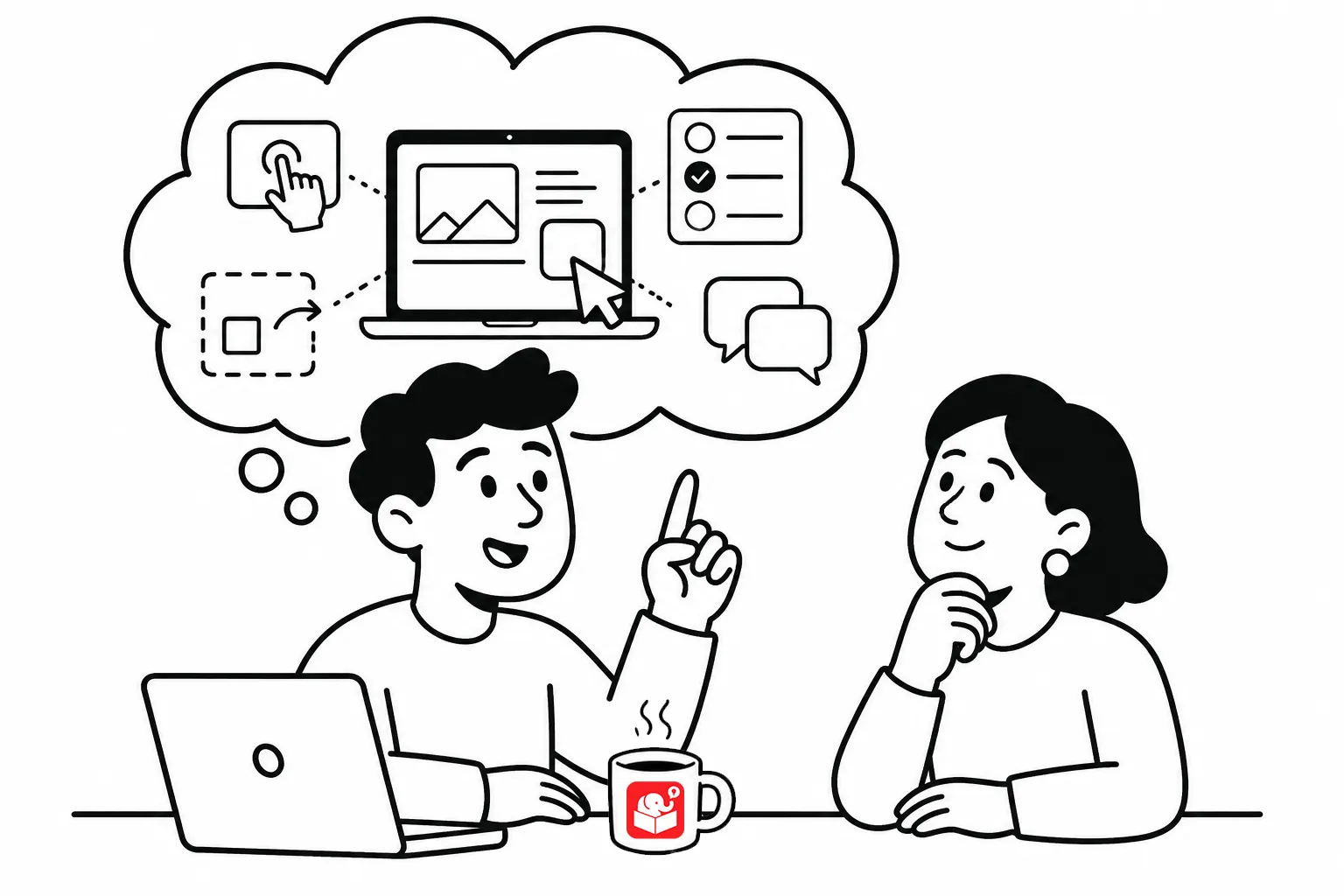
Most e-learning starts with a lot of content and not a lot of interactivity. And where there are interactions, they’re usually simple like tabs or accodions. But they’re not interactions to create a prove-it activity to assess the learner’s understanding. We want to move past click-and-read.
Three things separate genuinely interactive courses from click-and-read ones.
If you read this blog for long you’ll notice that I promote a few key concepts. Creating a course that is relevant to the learner is one of them.
The worst e-learning experience is being forced through a course that has nothing to do with your actual job. Many compliance courses fall into this category. Learners mentally check out, click through, and forget everything before they close the browser tab.
Relevance doesn’t automatically create interactivity, but it creates an engaged learner. An engaged learner doesn’t need interactive gimmicks to stay focused.
Talk to your learners and potential audience before you build. Ask how they’d apply the content in real situations. Let their answers shape your decision-making scenarios.
Linear courses aren’t bad on their own. Sometimes a step-by-step sequence is exactly right. The problem is when navigation is locked and learners can’t choose what to engage with.
Locked navigation often comes from the fear that learners will miss information. But forcing someone to view a slide doesn’t mean they absorbed it. Give learners freedom to choose how they move through the content. They’ll show you what they know and what they still need.
One practical move is to get the learner to touch the screen in new ways. Instead of four slides in sequence, present the same content as four tabs they choose to click. It takes the same information and turns the act of selecting into a small decision. It’s a simple interaction, but it gets them leaning into the course, moreso that a list of bullet points does.
Most course design pushes content at learners. Interactive design flips that by putting learners in a scenario with a choice to make. They have to find the information they need before they can decide. That’s what engagement actually feels like.
Some learners will jump in and guess. Others will read everything before deciding. Both are fine. What matters is that you’ve given the learner agency over the learning process.
This approach also answers the locked navigation argument. You can lock progress at decision points instead of individual slides. Learners move freely within each decision, but can only advance after demonstrating understanding. That’s far more meaningful than making sure they saw every slide.
The shift toward interactive e-learning isn’t primarily about tools or templates. It’s about asking a different question: how do you get learners to come looking for the information? Start with one course you’ve already built and identify one decision point you could add. What’s one course you’d redesign if you had the chance?