Physical Address
304 North Cardinal St.
Dorchester Center, MA 02124
Physical Address
304 North Cardinal St.
Dorchester Center, MA 02124
Helpful ideas. Squeaky value.
Helpful ideas. Squeaky value.
Practical tips for shaping course content — structuring lessons, choosing formats, and turning raw material into something learners can use.

You can build a course with well-organized content, clean navigation, and solid visuals, and still end up with something that doesn't stick. These three principles address why that happens.
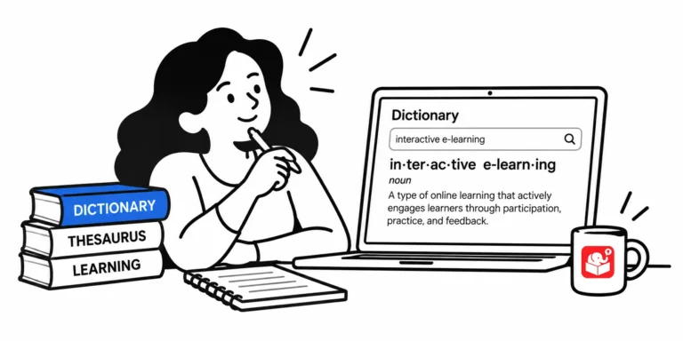
I hear "make it more interactive" constantly. But no one ever defines what that means. Once you understand the three main ways a course can be interactive, you can make smarter decisions about where to invest your development time.
A common pattern in e-learning is to list what people need to know and then quiz them on it. That approach measures recall, not understanding. Four design changes can close that gap.
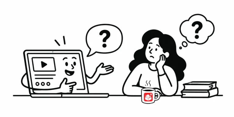
Real communication goes back and forth. Most e-learning doesn't. Here's how to build feedback and assessment into the course itself instead of leaving it all to a quiz at the end.
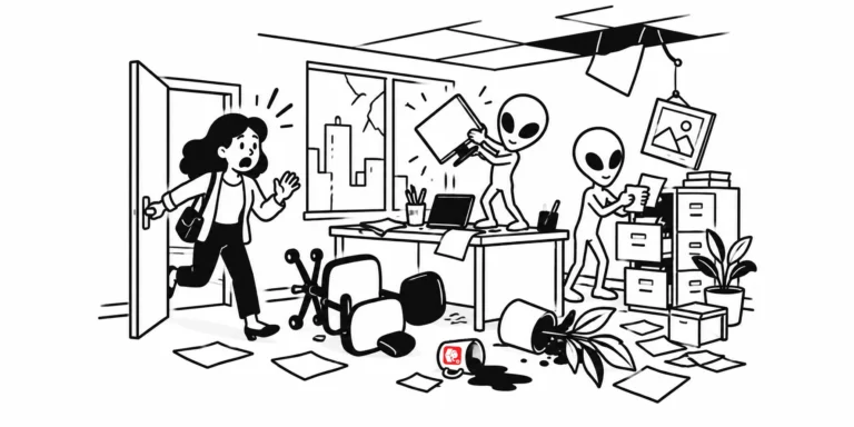
Real-world content can actually work against your course. Here's why flipping the scenario, even into something as odd as an alien abduction, keeps learners focused on the objective instead of the details they already know.
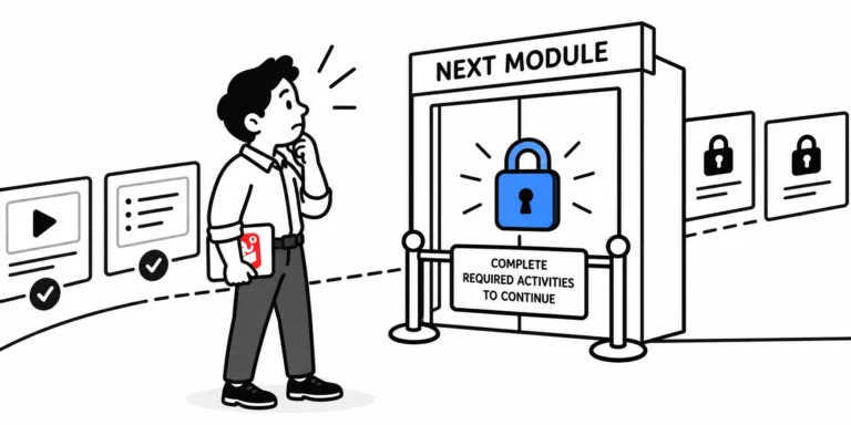
"We have to lock the course or people will just skip to the end." Sound familiar? Locking navigation is a common default in e-learning, but it solves the wrong problem. This post explains why, and what to do instead.
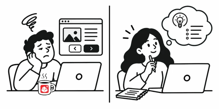
Stuck building another content-heavy compliance course? These 7 ideas show you how to add context, drama, and decision-making without a full redesign.
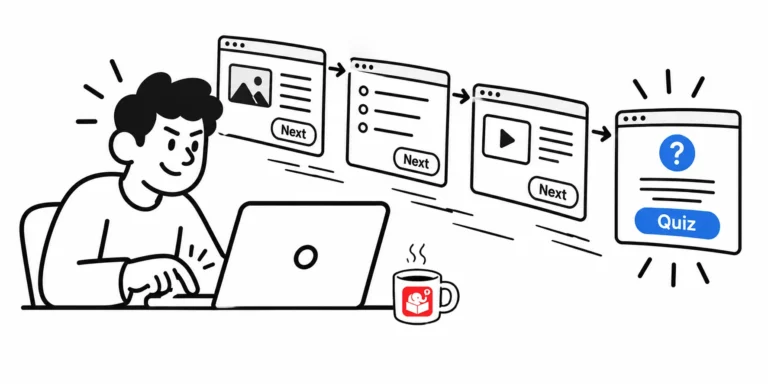
Most learners who skip to the quiz aren't lazy. The course just isn't relevant enough to hold them. These three approaches give you better options than locking the navigation.
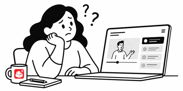
Knowing something and being able to use it are different things. If your course needs learners to make better decisions, not just pass a quiz, the design has to go further than a content dump.
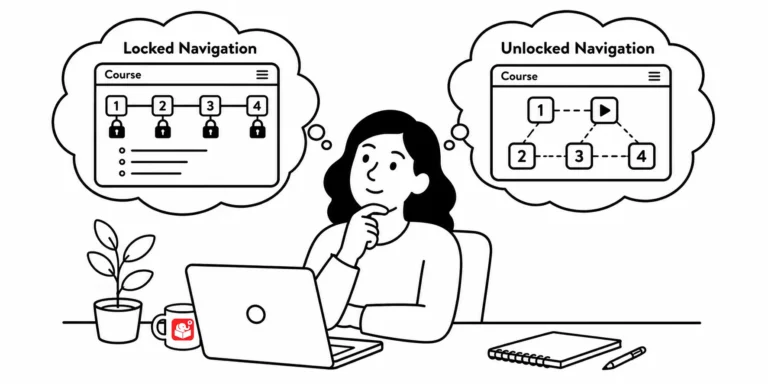
Locked course navigation is one of the most common e-learning frustrations, and it usually comes from good intentions gone wrong. This post breaks down why courses get locked and offers three practical ways to give learners more control without sacrificing your objectives.
Reality TV competitions have more to teach you than you'd think. From taking criticism to giving better feedback, here are five lessons from shows like Top Chef and Project Runway that can make you a sharper e-learning designer.
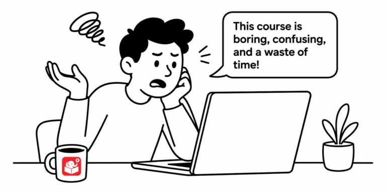
I asked a group of people to describe their training experiences. The same words kept appearing: boring, irrelevant, and a waste of time. That response is uncomfortable, but it's also a roadmap.
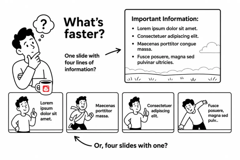
Your client wants 20 slides. Your SME insists on 50. But the learner never looks at the slide counter. The real question isn't how many screens a course has. It's whether those screens help learners do something they couldn't before.
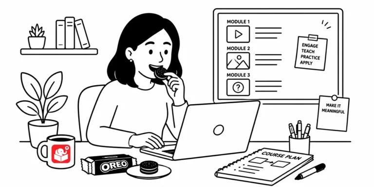
The easiest way to waste a training budget is to build a course nobody asked for. Most of us design around the content we have, not the problems learners face. The OREO framework gives you a practical way to flip that.
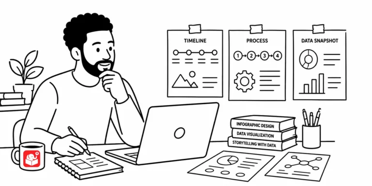
Infographics look great because they distill mountains of information down to a few essential points, the same challenge you face every time a subject matter expert hands you a 300-slide deck. Here's what they teach you about focus, color, fonts, and icons in your own courses.



