Physical Address
304 North Cardinal St.
Dorchester Center, MA 02124
Physical Address
304 North Cardinal St.
Dorchester Center, MA 02124
Helpful ideas. Squeaky value.
Helpful ideas. Squeaky value.

Look at the best-designed websites in any creative field. Many of them use handwritten fonts alongside clean typography because the combination feels personal. Here's how to bring that same approach into your e-learning courses.
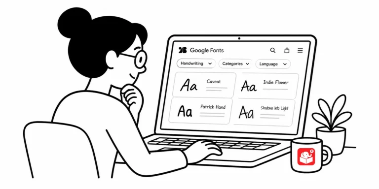
The question I get asked often is "What font are you using?" It's almost always asked when I've used a handwritten font. That's not a coincidence.

Infographics look great because they distill mountains of information down to a few essential points, the same challenge you face every time a subject matter expert hands you a 300-slide deck. Here's what they teach you about focus, color, fonts, and icons in your own courses.
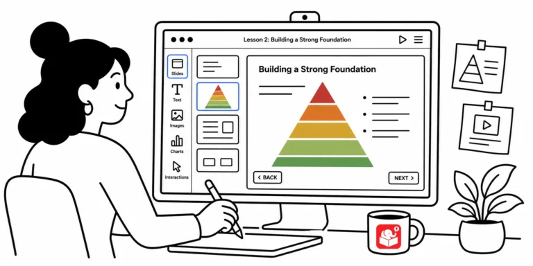
Open a random e-learning course and you'll often find graphics that seem to have landed on screen by accident. Every visual element communicates something to learners, whether you meant it to or not. These foundational design principles help you take control of that message.

Every time you build a branched scenario in Storyline, you probably spend minutes hunting for background images. There's a better way. Two methods turn that setup into a one-time task.

Once you've got the 3C model down for your scenario structure, the next challenge is building the visuals. Most people get stuck here because they don't know where to start. Breaking the design into five elements makes it manageable.

Finding the right map for an e-learning course is harder than it looks. Stock images tend to be too generic, and real online maps are too visually busy. Snazzy Maps solves both problems with a simple customization interface.

Most e-learning developers aren't trained graphic designers. But you probably already sense which colors belong in a safety course versus a call center course. That intuition is your visual voice, and it's one of the most practical design tools you have.
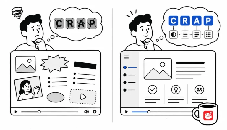
You don't need a design degree to build good-looking courses. You need four principles and the discipline to apply them.

Every visual choice in your course sends a message, whether you planned it or not. This post covers five common design mistakes that quietly undermine the story your course is trying to tell, and how to fix them before learners ever notice.

Your company website is full of images you can use in training. The problem is finding and saving them quickly. Two free tools make that much easier.

Most e-learning developers aren't trained graphic designers, and that's completely fine. But a few recurring visual mistakes make an otherwise solid course look unprofessional. Here are five of the most common ones and what to do about each.

Cluttered slides with competing colors are one of the most common visual design problems in e-learning. Two techniques can fix most of it: strip everything to greyscale and add one accent color, or go the other direction with bold silhouettes. Both are quick to apply and the results show immediately.

Most e-learning developers aren't graphic designers. But a few core principles can take your courses from visually cluttered to genuinely clear. Here are three that make the biggest difference.

Most e-learning developers came up through training, not design — and it shows. This post covers the visual design principles every course builder needs, why AI tools can't replace that foundation, and one book that puts it all together.



