Physical Address
304 North Cardinal St.
Dorchester Center, MA 02124
Physical Address
304 North Cardinal St.
Dorchester Center, MA 02124
Helpful ideas. Squeaky value.
Helpful ideas. Squeaky value.
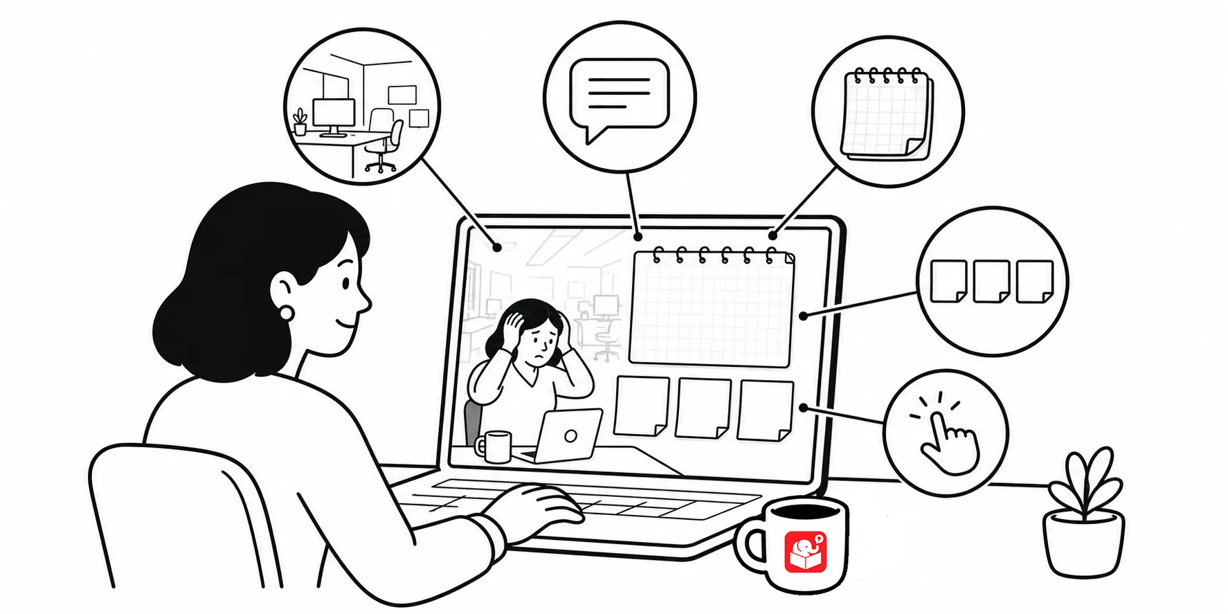
As we looked at previously, the 3C model gives you a simple structure for building branched scenarios: challenge, choices, and consequences. Once you have that, the next question is how to make the scenario look.
Most people get stuck here because they don’t have graphic design backgrounds. Breaking the visual design into five parts makes it much easier to plan and think through what to design.
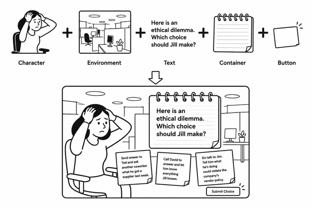
Almost every scenario screen I build includes some combination of the same five elements:
You don’t need all five on every screen, but knowing what they are helps you think through the design before you start building.
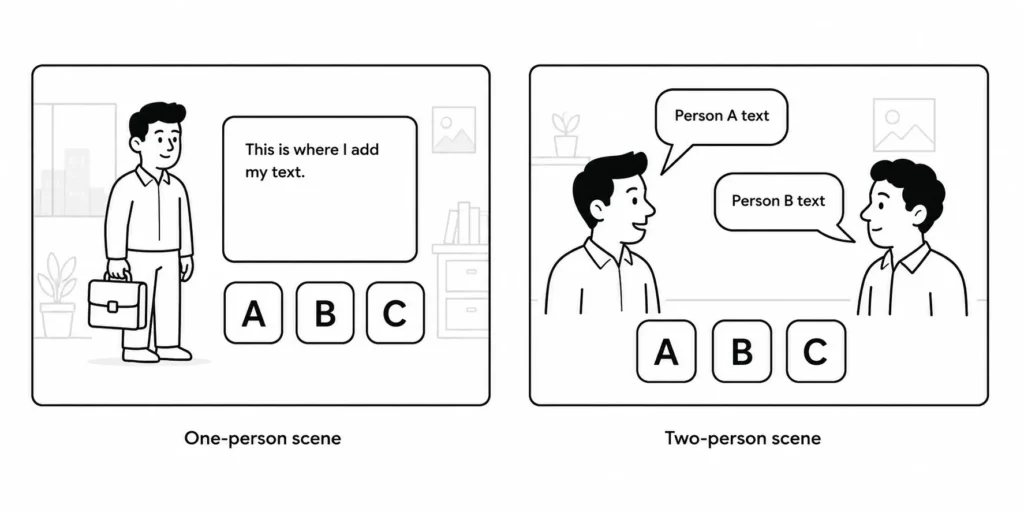
Characters are the people or avatars in the scenario. You can have one or more. Build a few placeholder templates, a single-person version and a two-person version, so you have options ready when you need them. And you can swap out the characters pretty easily.
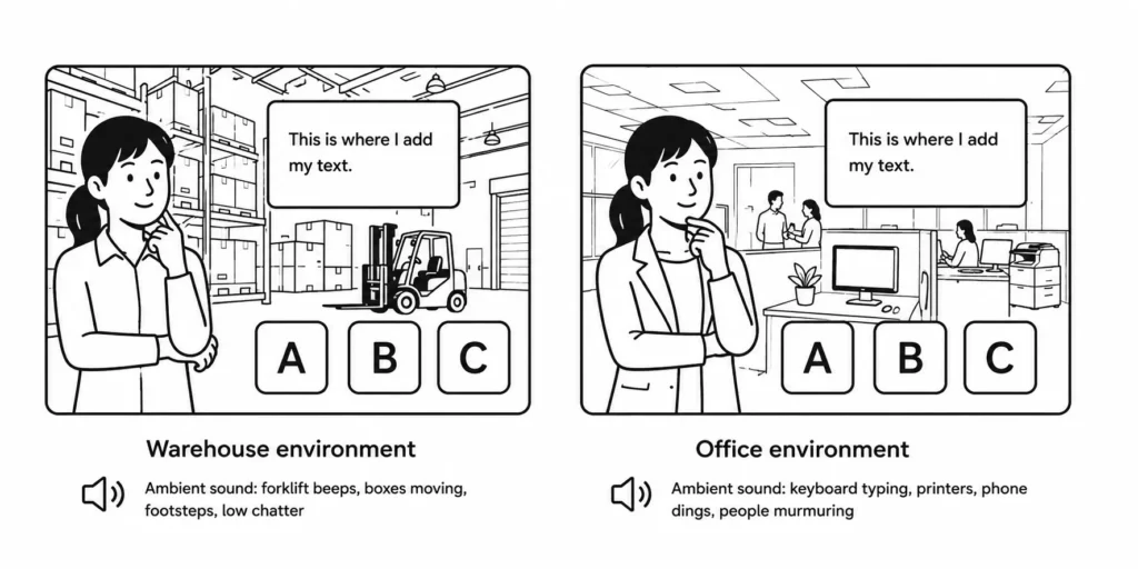
The environment is the backdrop. It tells the learner where the scenario is taking place. An office, a warehouse, a customer service counter. The environment sets the tone and visual context. Bonus: adding ambient audio that matches the setting can make it feel more real.
Here’s a good post on building the template with a background.
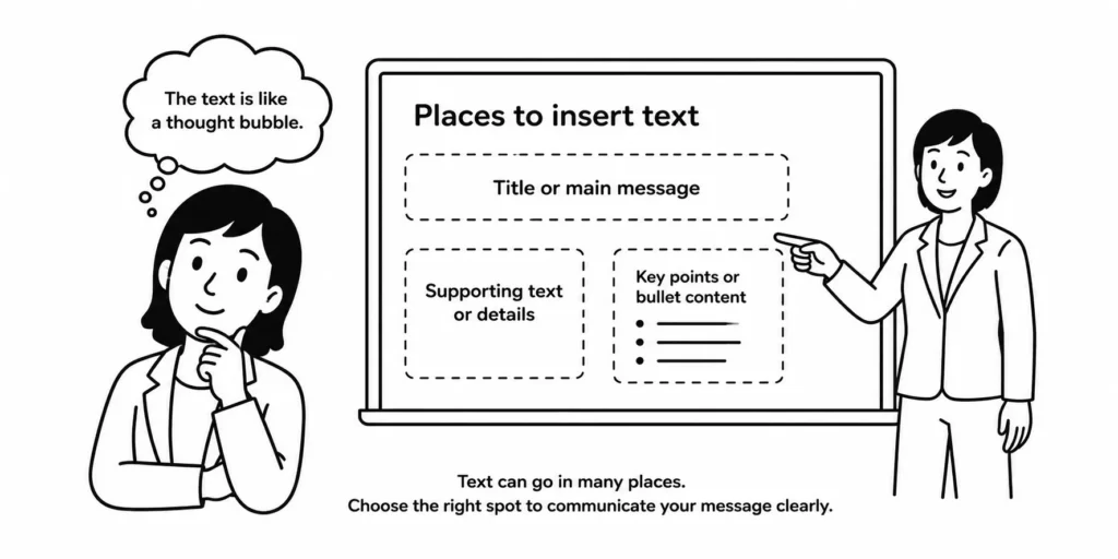
Text is the written content of the scenario. It could sit directly on the slide or inside a container. Pay attention to the font you use. A formal font communicates differently than a handwritten one. Make sure the font fits the scenario. A lot of people like to use a comic-style font for text.
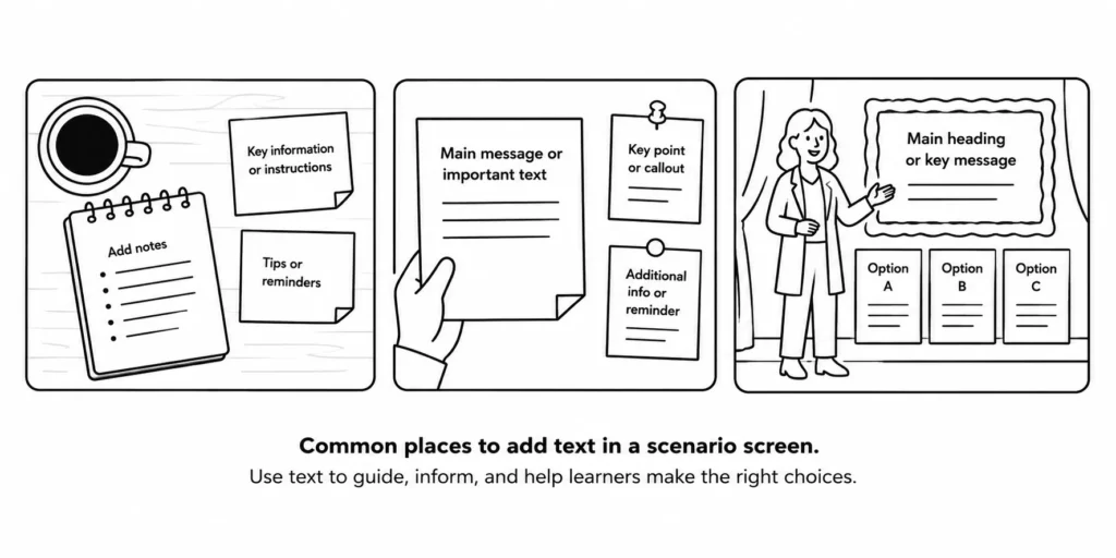
Content containers hold the text or the choices. To me this is the key part of the scenario because most of what is on the screen will be written and you need a space big enough to add text and account for margins. And visually you can do some interesting things that fit the context.
A speech bubble, a note card, a sticky note, an instruction box. These add visual structure to the screen. Pick a container style that fits the overall look of the course and use it consistently.
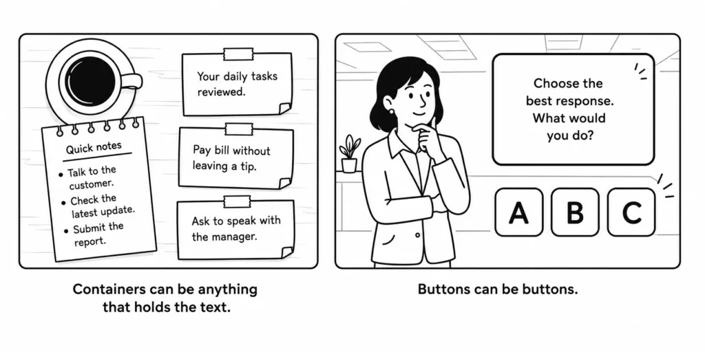
Buttons or hotspots are how the learner makes their choice. They could be actual button shapes, clickable images, or paper strips (as in the example above). Design them to look like part of the scenario rather than an afterthought. One of my pet peeves is someone designs a really nice looking screen and then inserts the deault buttons. They work, but often don’t look like the belong with the rest of the design.
The real workflow is to pre-build generic templates using placeholders for each of the five elements. When you need a scenario, drop in the right template and swap the placeholder assets for real course content. The layout in the final version doesn’t have to match the placeholder exactly. Think of it as a guide, not a constraint.
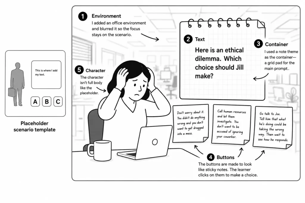
When building the templates, keep your placeholder assets the same size as the real ones you’ll use. This saves you from resizing and repositioning every time you make a swap. And don’t lock yourself into the placeholder layout. If the real content calls for a different arrangement, move things around.
If you’re using Rise, which is form-based, you have some options with the scenario block, but there’s no reason why you can’t create a scenario structure with blocks in a lesson. That gives you a lot more freedom in the visual design. And then you can save the lesson content as a template to use again.
Keep the screen simple. It’s easy to add too much when building a scenario. Only include what the learner needs to see. If something doesn’t help them understand the situation or make the choice, leave it out.
Many people building e-learning courses work alone or on small teams without graphic design support. Pre-built templates solve that problem. Build a library of scenario templates in two-choice, three-choice, and four-choice versions. When you need a scenario, you’re not starting from scratch. You’re just filling in the blanks.
Next time you build a scenario, start by mapping out which of the five elements you need: characters, environment, text, containers, and buttons. Then pre-build a template with placeholders before you have the real assets. It makes the whole process faster and more consistent.