Physical Address
304 North Cardinal St.
Dorchester Center, MA 02124
Physical Address
304 North Cardinal St.
Dorchester Center, MA 02124
Helpful ideas. Squeaky value.
Helpful ideas. Squeaky value.
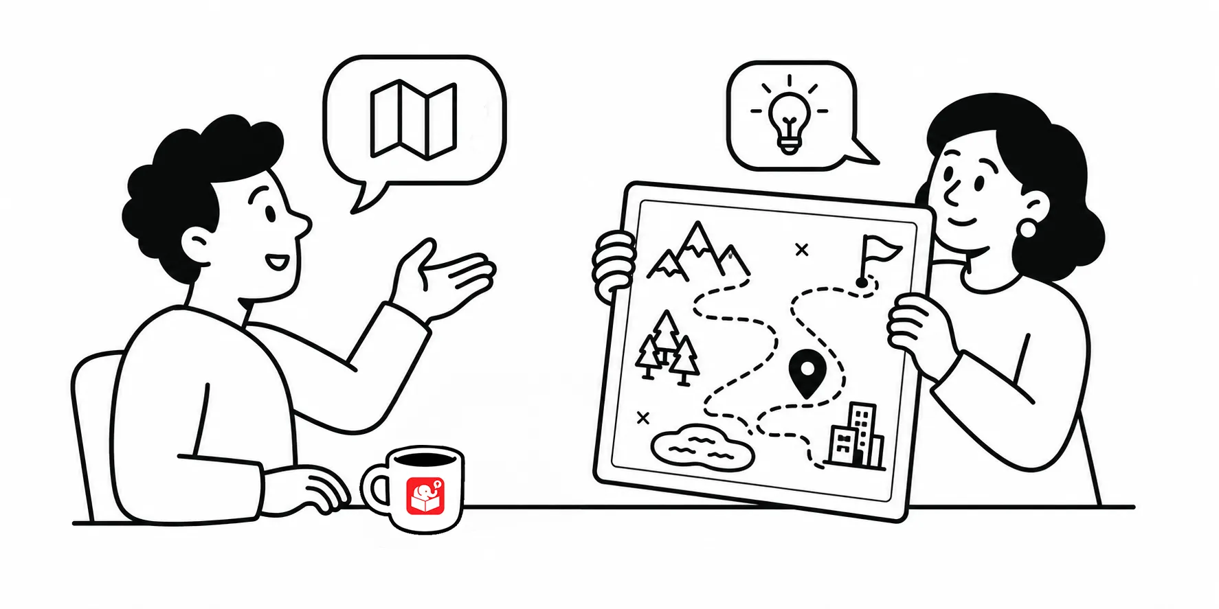
A labeled map interaction sounds simple until you start looking for the right map. Stock image sites give you generic illustrated versions that don’t match the place you need. Screen-grabbing from Google Maps gives you something too cluttered to read.
A map that shows too much pulls attention away from what you’re trying to teach. In a labeled map of Washington, D.C., your markers compete with road names, business labels, colors, and transit lines.
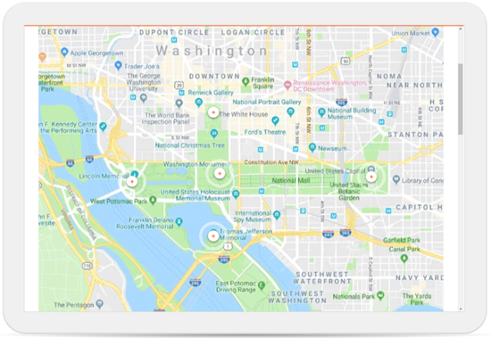
Learners don’t know where to look first. The map stops being a visual aid and becomes another source of confusion. The goal is context, not navigation. Compare the map above to the map below. Same city, but a lot less visual noise. Works great with a labeled graphic.
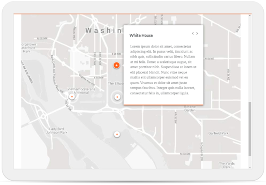
The maps were created with Snazzy Maps. A free site at the time of posting. Snazzy Maps works with Google Maps and lets you control which layers of detail are visible. You can turn off road labels, remove business names, or strip everything down to a grayscale shell.
A grayscale map is especially useful when you want your content labels to stand out, like in the image above. The accent colors in your interaction become the most vivid thing on the screen. The site also has a library of presets from other users, which makes a good starting point.
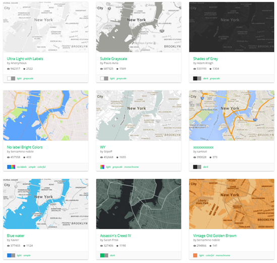
Some interactions call for a stripped-down map. Others benefit from a bit of color to show parks, water, or landmarks in relation to your content. The key question is what the map is meant to do. If it’s purely for orientation, go minimal. If the geography itself is part of the lesson, keep enough detail to make the relationships clear.
Visual design in e-learning often comes down to subtracting rather than adding. A map that does its job well is one where the content labels are the clearest thing on the screen. As you build more map interactions, you’ll develop a feel for how much detail to keep. Snazzy Maps fills a gap that stock images and raw screenshots can’t. Have you run into map problems in your courses, and what solutions have worked for you?