Physical Address
304 North Cardinal St.
Dorchester Center, MA 02124
Physical Address
304 North Cardinal St.
Dorchester Center, MA 02124
Helpful ideas. Squeaky value.
Helpful ideas. Squeaky value.
After I published a post rounding up free handwritten fonts, a few people asked what to actually do with them, mostly because they’re too informal and may conflict with branding requirements.
I say, handwritten fonts aren’t just a text choice. They’re a graphic element that changes the feel of a course. In this world of AI, any place you can add personality and a touch of humanity, is a place to be.
Look at some of these images from this post on sites with handwritten fonts to see how the handwritten font choice impacts the emotional feel of the site. How would that change if the font was replaced with something more corporate? Swap those for Times New Roman and the whole thing falls apart.
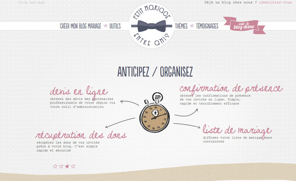
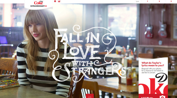
Some of the best-designed sites use handwritten fonts as part of their visual identity.
I always enjoyed the way Kathy Sierra’s “Creating Passionate Users” blog images used handritten fonts. It always felt like I was privvy to her notes and by extention, her thinking. Unfortunately her site no longer exists, but this has a lot of good content from her blog.
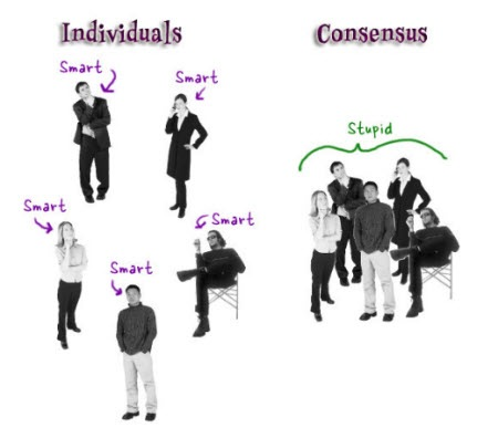
The goal is to use them strategically, not everywhere. Most courses look generic. A corkboard theme with handwritten annotations stands out.
Think of it like the instructor leaving personal notes in the margin. Or like the director’s commentary on a DVD, the same content but with a layer of personality added on top. That’s the effect you’re going for.
Here are some specific places they work well:
How you use handwritten fonts matters as much as where you use them. A few specifics make the difference between looking deliberate and looking like an accident.
Use dark gray instead of black for the ink. It reads warmer. Bold marker colors like red or blue work better than gentle pastels when you want contrast. Rotate the text slightly off horizontal so it looks hand-done rather than printed.
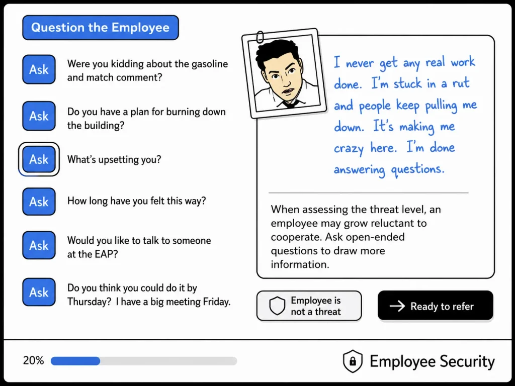
In the example above, we used blue handwritten text to represent the informal nature of teh interviewees answer. The answer becomes the focal point.
Pick one course you’re working on and find one spot to experiment. A callout, a key point, a quiz answer. Grab a few free handwritten fonts if you don’t have any. Play with rotation, color, and contrast until it feels right.