Physical Address
304 North Cardinal St.
Dorchester Center, MA 02124
Physical Address
304 North Cardinal St.
Dorchester Center, MA 02124
Helpful ideas. Squeaky value.
Helpful ideas. Squeaky value.
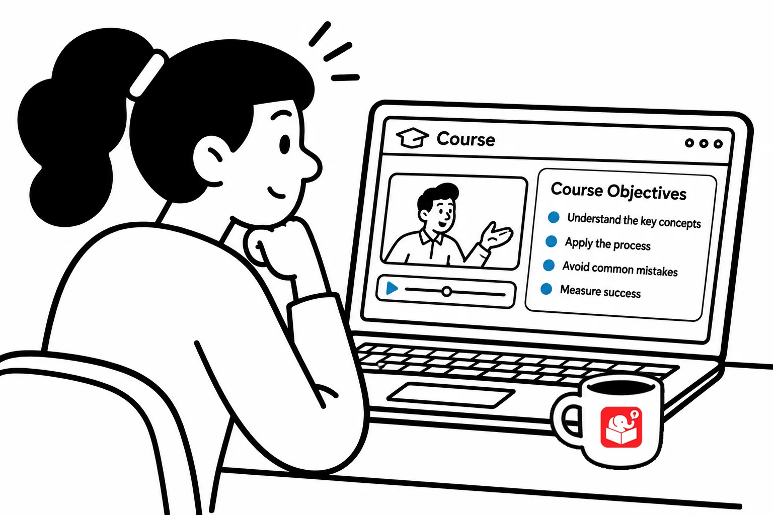
You’ve probably seen that screen at the start of an e-learning course. It’s a bullet list of learning objectives that most learners scroll past without reading. The reason these exist is because it’s how many of us were trained and it’s what we’re all used to seeing.
A bullet list of objectives isn’t bad. it tells the learner what they’ll learn in the course. But that doesn’t mean that’s how we have to deal with objectives in the course.
This post covers two interactive alternatives that satisfy the requirement without losing the learner.
A bulleted list isn’t wrong. It just presents everything at once and asks the learner to absorb it all before moving on. For a long list of objectives, that’s a lot of cognitive work up front.
The screen also tends to clutter quickly. Five or six objectives stacked on a slide create visual noise. Most people skim it, click next, and forget what they saw. That’s not a great start to a learning experience.
The first alternative puts one objective on each screen with navigation arrows. The learner moves forward and back through the objectives one at a time. It’s simple to build.
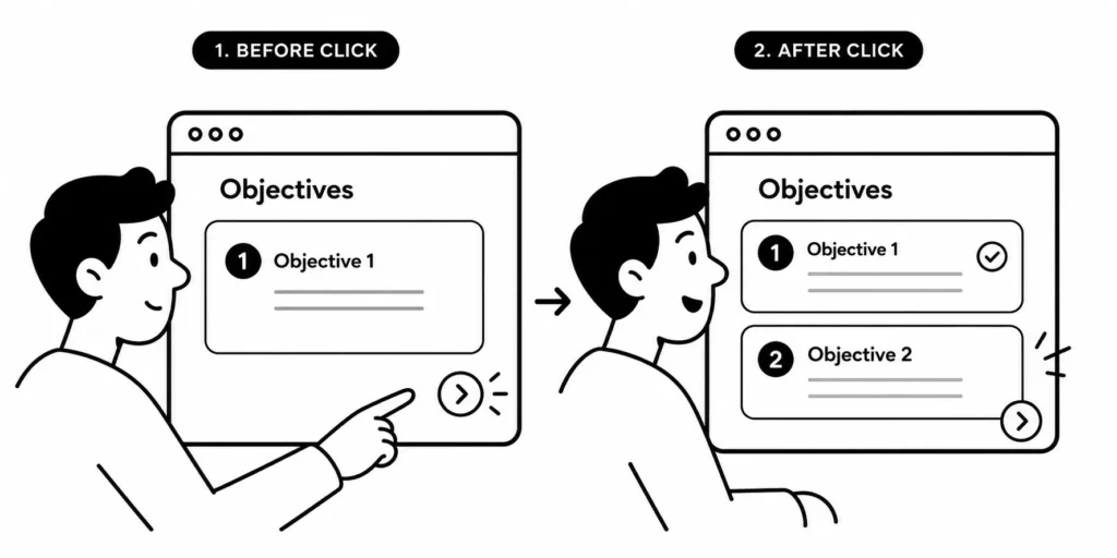
This approach reduces cognitive load by showing one idea at a time. The screen stays clean. The learner focuses on the single objective in front of them rather than scanning a stack of bullets. That focus carries over into the first lesson.
The second option places all the objectives as small, clickable indicators along the bottom of the screen. The learner can click any one of them directly to see that objective. They’re not forced to step through them in order.
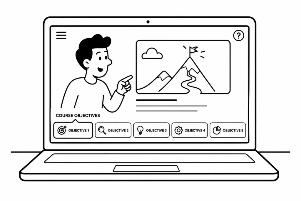
It’s a bit novel, but this approach gives the learner some control over the experience. They can scan all the objectives quickly or focus on the ones that matter most to them. It also makes the screen feel more like an interface than a one-way announcement. The learner drives it.
Both approaches work and both are easy to build. The progressive reveal is more linear and simpler to set up. The clickable version takes a bit more effort but gives learners more flexibility.
The clickable option has one clear advantage: learners can jump directly to the objective they care about. That matters if your audience includes people with prior experience who already know some of the content. For general audiences, either works well.
Learning objectives don’t have to live on a static screen at the start of your course. Pick one of these approaches, build a quick prototype, and see how it feels in context. A well-designed objectives screen won’t transform a course, but it sets the right tone for everything that follows.