Physical Address
304 North Cardinal St.
Dorchester Center, MA 02124
Physical Address
304 North Cardinal St.
Dorchester Center, MA 02124
Helpful ideas. Squeaky value.
Helpful ideas. Squeaky value.
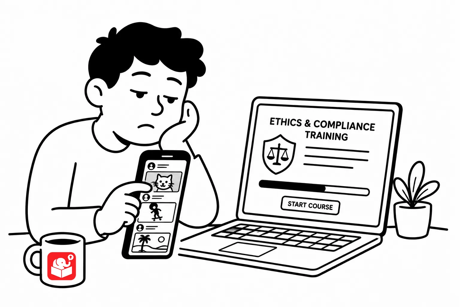
Over the years I’ve noticed my own reading habits have changed. Deep, sustained reading used to come easy to me. When I was working on my Master’s I already started to notice that it was harder for me to focus on the pages. And now with my trained doomscrolling it’s even more challenging to stay focused. When I pick up a book, after a few pages, my mind drifts.
This isn’t unique to me. It’s something that impacts most of us. And this is what our learners are doing when they open the course. Here are a few tips to design better.
People online scan before they commit. They look for the structure first — headings, visual anchors, anything that helps them figure out whether the page is worth reading. If your course fights that instinct, you’ll lose them before the content has a chance to work.
Structure your information so the most critical points are visible at a glance.
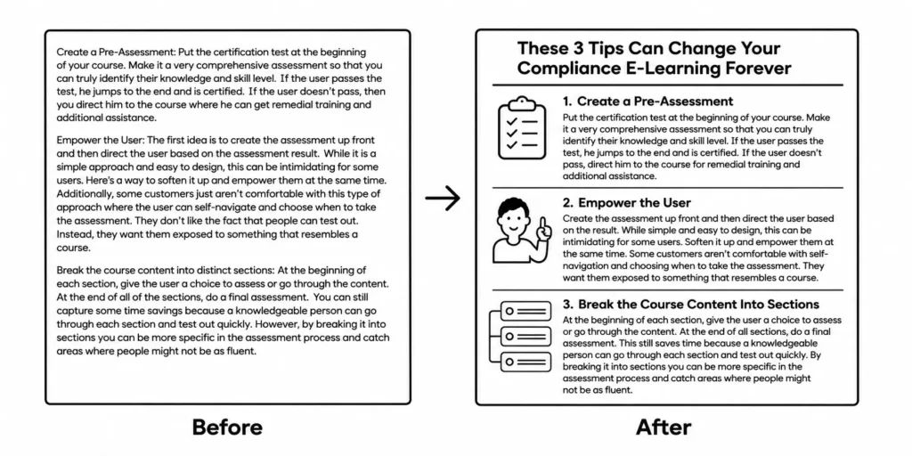
This isn’t new. This is a general principle outlined in the CRAP visual design concept.
When people scan, they pick up the first thing that stands out. If the most important content is buried in the middle of a paragraph, they’re going to miss it.
Pull key information to the surface. Use visual hierarchy to tell the learner’s eye where to go. Don’t make them hunt for what matters. The information doesn’t have to be simpler — it just has to be easier to locate.
Most e-learning is designed as a one-way street: here’s the information, in this order, click next when you’re ready. That’s not how people naturally look for things they need. They browse, backtrack, and skip around.
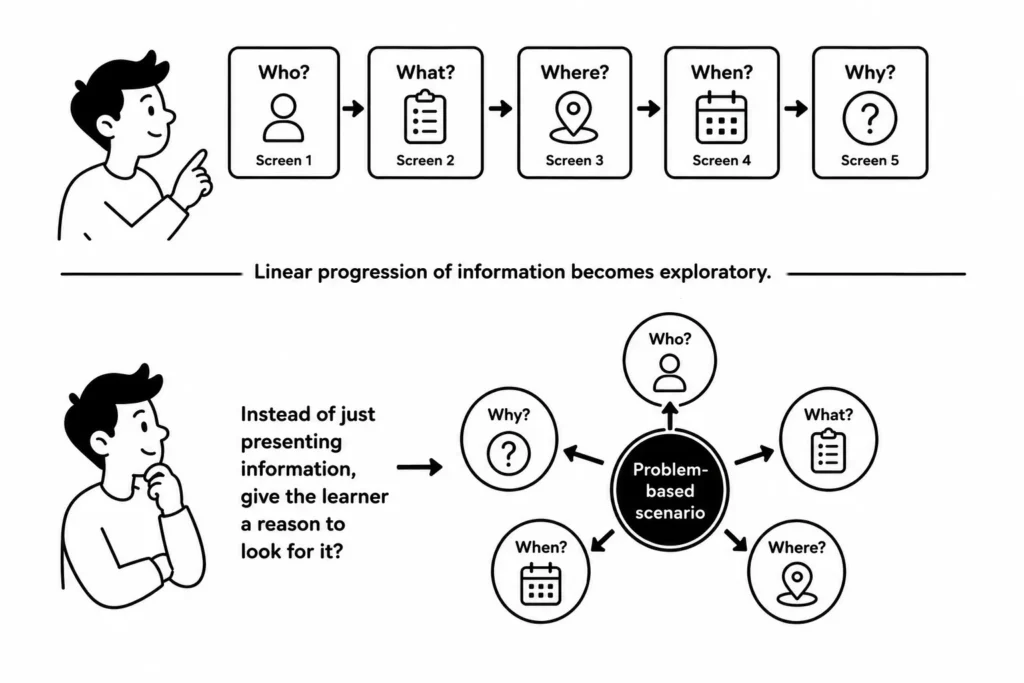
Build courses where learners have a reason to need the content rather than a requirement to view it. Give them a problem to work through. Make the course something they navigate rather than something they endure.
When learners are exploring, they’re engaged. When they’re clicking Next to get to the end, they’ve already checked out.
Too much e-learning stops when the module ends. The learner completes the course, takes the quiz, gets the completion certificate, and then never applies anything because there’s no bridge back to actual work.
There are simple ways to build that bridge. Use case studies or scenarios that mirror situations learners will actually face. Have learners apply something from the course before the follow-up meeting.
Build in an activity that requires them to find something at their actual work site. The course doesn’t have to do all the teaching — it just has to connect learners to the learning that happens outside of it.
If your course is mostly narrated text, you’re leaving capabilities on the table. Graphics, video, interactivity, audio — each of these reaches learners differently. None of them require Hollywood production skills. A clear diagram often explains something faster than three paragraphs of narration.
The good thing is you can drop some content into AI and ask it to generate some sort of infographic or visual that communicates the key concepts.
Start with the communication problem and then ask what format serves it best. Sometimes that’s text. Often it’s something else.
Accommodating how learners actually read isn’t the same as lowering the bar. You can design for power browsing and still go deep on complex content. The format changes; the rigor doesn’t have to. Clear structure, visual hierarchy, and real-world application make hard content more learnable, not less.
If your course is a wall of text that assumes sequential reading, the problem isn’t the learners. It’s the design. You’re the problem.