Physical Address
304 North Cardinal St.
Dorchester Center, MA 02124
Physical Address
304 North Cardinal St.
Dorchester Center, MA 02124
Helpful ideas. Squeaky value.
Helpful ideas. Squeaky value.
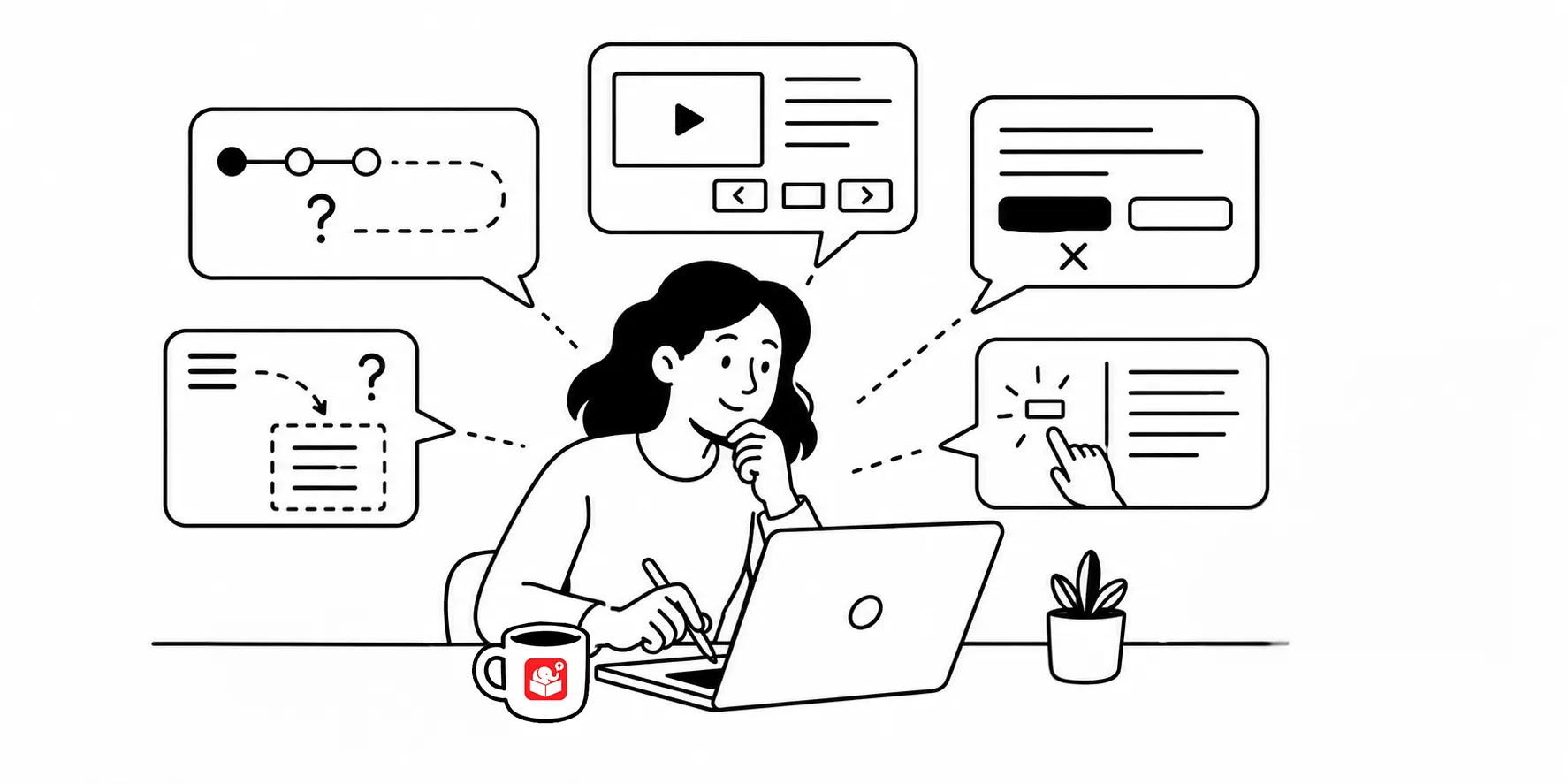
A web usability article once described five problems found across 100,000 studies. The issues ranged from confusing navigation to unclear instructions. While it was specific to websites, most of the issues translate directly to e-learning course design.
The good news is that most of these problems are fixable. They show up quite a bit, which means there are reliable ways to catch them. The habits below address the ones that appear most often in e-learning courses.
One of the most common problems in e-learning is what you might call the bouncy button. The navigation control shifts position from screen to screen because the content layout changes. The learner has to hunt for it each time.
If you’re using the defaul player, this is mostly fixed. However, if you add your own links and navigation, this is something to consider.
The fix is intentional consistency. Decide where navigation controls live and keep them there. Like I said, this is less of an issue with the default player, but as soon as you add custom navigation, the responsibility shifts to you.
Another common issue happens when you combine multiple tools in one course. The navigation might conflict. The player controls might appear twice. The menu might duplicate. The learner ends up with a confusing mix of interfaces that don’t belong together.
If you’re an Articulate 360 user, Storyline’s unified player and Rise’s consistent layout handle most of these problems automatically. Still, watch for anything you’ve added outside the default template that could create confusion. This can be iframes, embedded content, or vibe-coded interactions.
One quick test: have someone sit down with your course and narrate what they’re doing. If they say “where’s the button,” you’ve found a usability problem.
The goal is for your course to feel intuitive without explanation. But some interactions need context, especially custom ones that work differently than the learner expects and or deviates from what they were doing in the course.
Gate screens are one useful approach. They pause the course and refocus the learner on the instructions and that something is different before a new type of interaction begins. You can use them to set expectations, give a quick instruction, or just signal that something different is coming. Used sparingly, they prevent confusion without adding friction.
This is something I run into all the time. You’re too close to your own course to catch every usability problem. Find a few people who don’t normally take e-learning and watch them work through it. Don’t guide them. Just observe.
Most of the time, you’ll find that your instructions weren’t as clear as you thought. Or that a button label made sense to you but not to someone else.
A small test group, even two or three people, surfaces these issues before they reach a wider audience.
Iterate based on what you observe. Fix the problems you can confirm and retest if needed. That loop is faster and cheaper that waiting to build the entire course.
Usability problems don’t just frustrate learners. They erode trust in the content itself. When a course is hard to navigate, it may come off as unprofessional and learners start to question whether the material is worth the effort. Build usability checks into your process and test before you publish, not after.