Physical Address
304 North Cardinal St.
Dorchester Center, MA 02124
Physical Address
304 North Cardinal St.
Dorchester Center, MA 02124
Helpful ideas. Squeaky value.
Helpful ideas. Squeaky value.
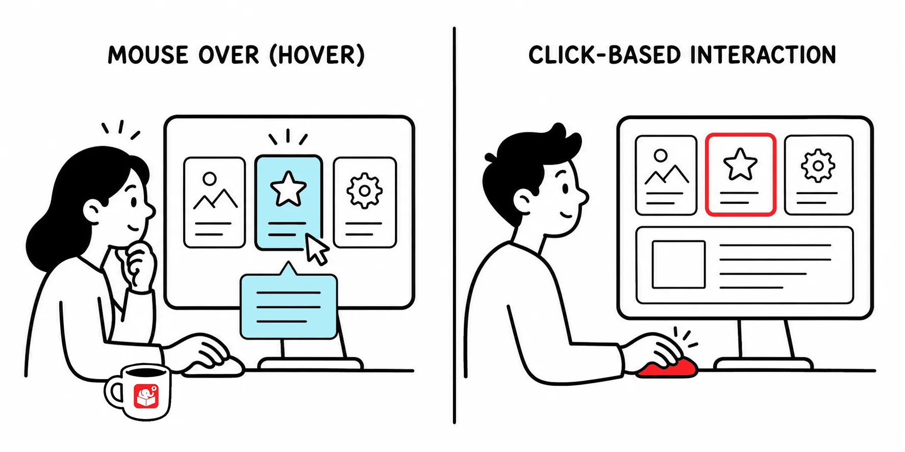
Her’s a look at where mouseover interactions stand today. You hover over a button and it changes color to show it’s active. You slide your cursor over a diagram label and a tooltip pops up with extra detail. These interactions feel natural on a desktop, but they have a problem.
Mouseover interactions show up in courses in a few different ways. Most of them fall into one of three categories.
Button hover states are the most common. A button changes appearance when the cursor passes over it, signaling that it’s active and clickable. This is standard interface behavior that learners recognize from everyday web use.
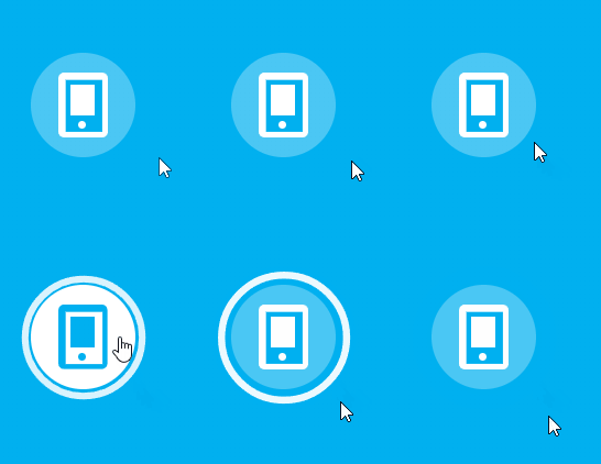
Expanding information panels are another common use. A learner hovers over an image or a labeled element and a panel appears with additional context. It’s a way to pack more content into limited screen space without cluttering the slide.
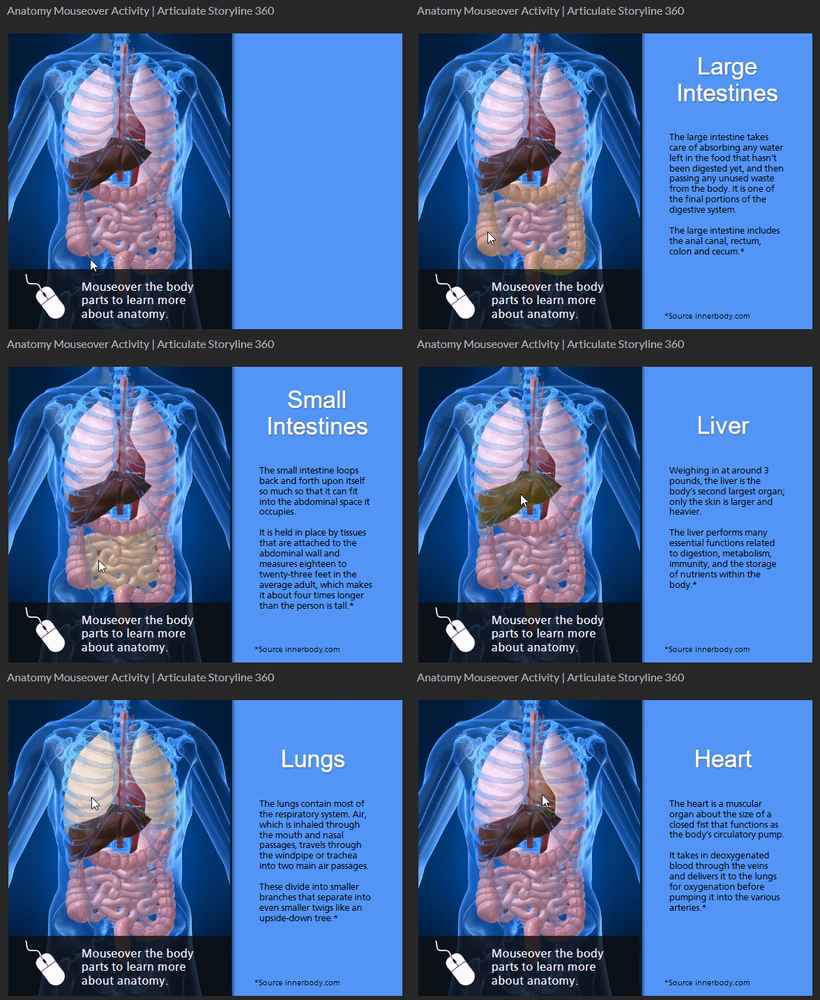
Tooltips provide a third option. Hovering over an icon or interactive element surfaces a short hint or description. Software simulations and labeled diagrams use these a lot.

Two shifts have made mouseover interactions harder to justify.
Neither problem is impossible to work around. But both require extra effort. For most new projects, it makes sense to design with clicks from the start.
The cursor-based interaction isn’t going away completely, but its role in course design is shrinking. As mobile use grows and accessibility expectations rise, the click will carry more weight in your designs. Starting click-first means less retrofitting later. It’s worth asking, before your next project, which of your hover interactions could work just as well with a click.