Physical Address
304 North Cardinal St.
Dorchester Center, MA 02124
Physical Address
304 North Cardinal St.
Dorchester Center, MA 02124
Helpful ideas. Squeaky value.
Helpful ideas. Squeaky value.
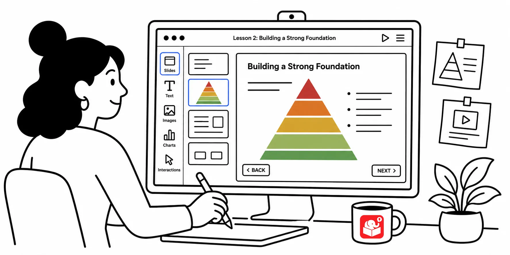
Open your average e-learning course and the visuals tend to feel arbitrary. Graphics appear without purpose, shapes get dropped in because they “look good.” But every design choice either supports your content or works against it.
A designer shared a course with me where content was arranged in a pyramid layout. I assumed that because of the pyramid structure there was a relationship in the content. However, the content had no hierarchical relationship at all. Which ended up creating come confusion a few screens later.
Learners noticed the implied structure and then couldn’t reconcile it with what followed. That one visual choice created confusion from slide one.
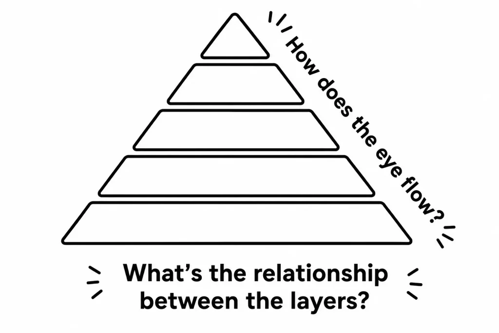
Look at the pyramid graphic. Without a single label, it tells a story. It implies hierarchy and layers that build on each other. Your learners will read that meaning into your content whether you intended it or not.
Arrows work the same way. They imply movement and direction. You follow from the tail to the point. Used with intention, that shape reinforces your teaching. Used carelessly, it distracts.
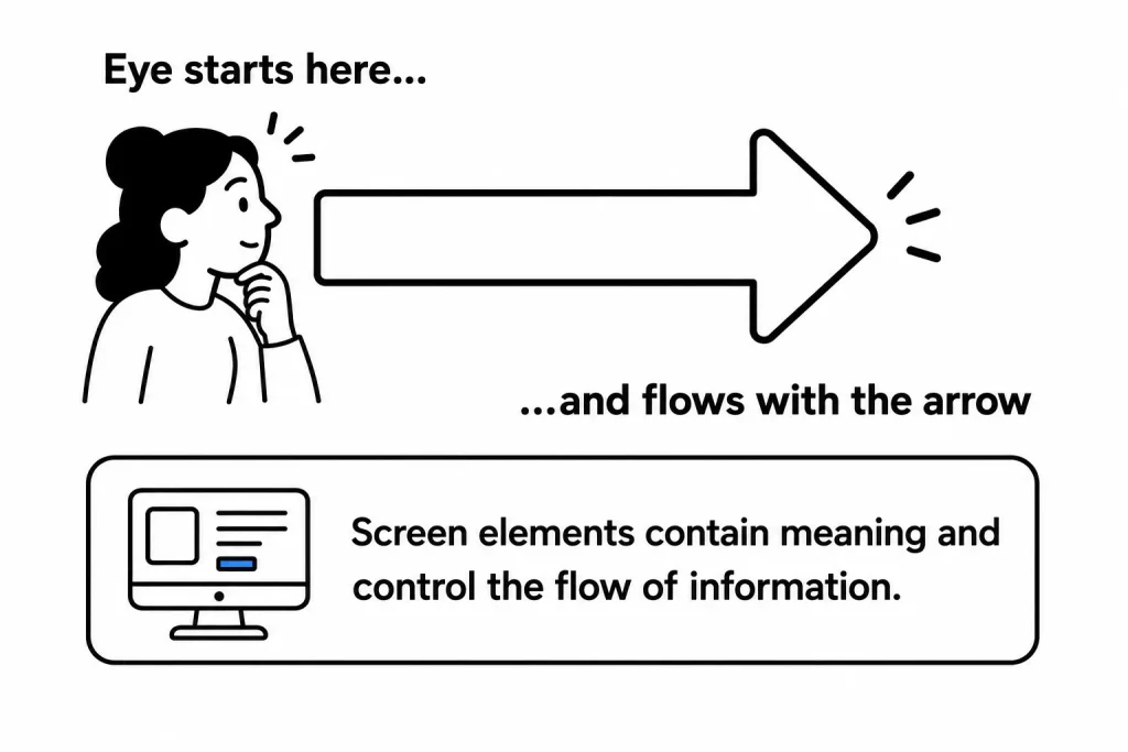
Nothing on your screen is there by accident. The layout you choose, the shapes you use, the way you arrange information: all of it implies meaning. Your job is to make sure that implied meaning matches your content.
In her book Slide:ology, Duarte does a great job detailing all sorts of abstract shapes and diagrams that imply some concept. Many of them are relevant to the types of information seen in elearning courses. It’s worth reviewing if you have the book.
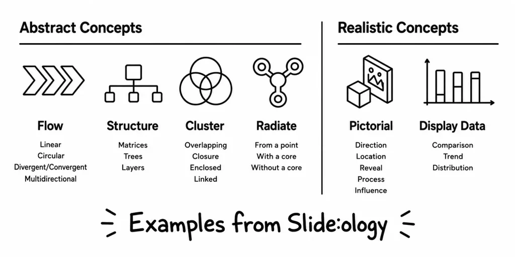
The main point in all of this is that nothing on your screen is there by accident. How you organize content on the screen implies meaning whether it’s intended or not. Everything you place on it should contribute to meeting the course’s objectives.
You don’t need to become a professional designer. You need just enough of the fundamentals to make smarter choices. These three books are solid starting points.
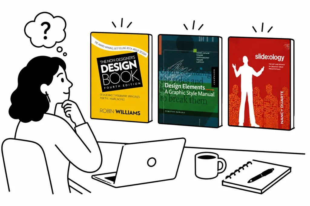
With some practice, you can build competence rather than expertise. The goal isn’t beautiful courses. It’s courses where every visual element earns its place.
The shift from passive to intentional design is simpler than it sounds. Start asking one question about every element you place on screen: why is this here? That habit changes how you build. Over time, your courses get cleaner and your learners get less confused.