Physical Address
304 North Cardinal St.
Dorchester Center, MA 02124
Physical Address
304 North Cardinal St.
Dorchester Center, MA 02124
Helpful ideas. Squeaky value.
Helpful ideas. Squeaky value.
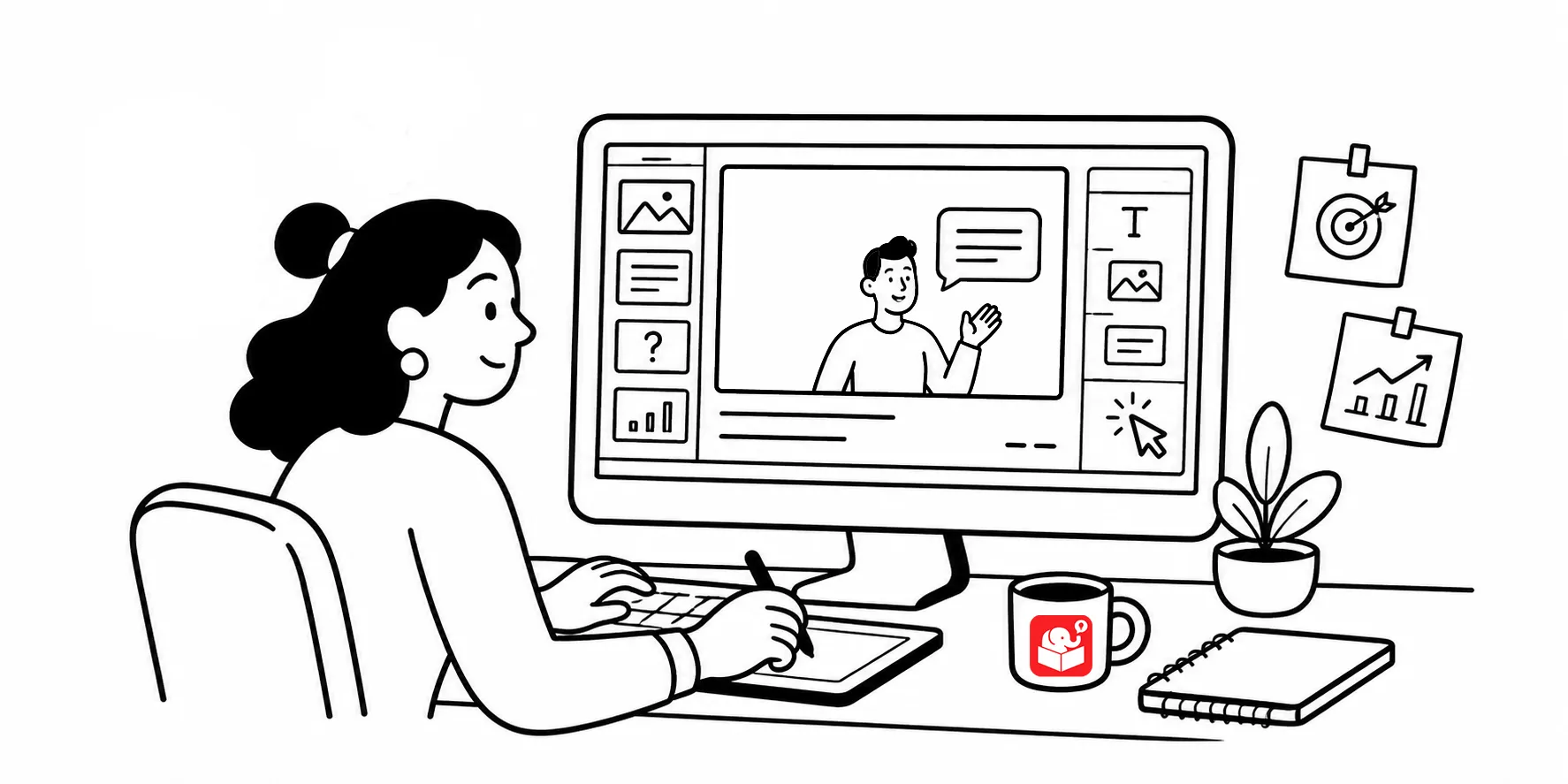
As I update this post, I reviewed an older design story from Google’s team that read like many e-learning project I’ve worked on. There were debates about navigation, presentations that flopped, and designers who couldn’t get buy-in. The challenges were familiar, and so were the solutions.
So I reframed the article’s core points and how it relates to a lot of e-learning.
Learners come to your course with expectations about how things work. Navigation is one of the biggest.
People scan screens in Z and F patterns. The back and forward buttons belong at the bottom right. Not because it’s a rule, but because that’s where people ten look for them last, after scanning the rest of the screen.
You are free to design as you wish. And obviously mobile devices have an impact on navigation, but if you deviate from expected navigation, have a reason. Don’t move buttons around because there wasn’t room, or because you wanted something to look different.
When learners start thinking about where to click instead of what they’re learning, you’ve lost them.
White space isn’t empty space. It’s a design tool, and it does real work.
The instinct for many people is to fill the screen. An open corner becomes a vacuum that attracts more content. Probably why we have so much clip art, AI slop, and decorative images. But adding graphics just to fill space creates visual noise that competes with the actual information.
I’ve seen a client request an additional course module just to fill a blank corner of a menu screen. That’s a real example. White space earns its place by giving the eye room to breathe and focus on what matters.
Change is hard to push through, at Google and everywhere else. That doesn’t mean it’s not worth pursuing.
The useful question is: how much effort is this change worth? If it genuinely improves the learning experience, find a way to make it happen. If the friction outweighs the gain, put your energy somewhere else. Knowing when to keep pushing and when to stop is a real skill.
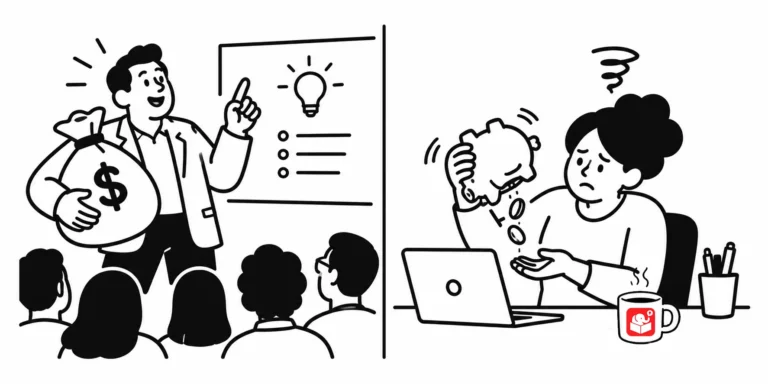
Presenting three or four decent options isn’t leadership. It’s delegation. When you show clients multiple directions without a recommendation, you’re asking them to make the call they hired you to make.
“They presented then-CEO Eric Schmidt and other leaders with a set of four different concepts, with themes like making Google more like desktop clients, or differentiating products by color. It sounded like there were too many options and not enough conviction.”
Options are useful when they reflect different strategic directions. One option solves for compliance, another for performance support. That gives clients a real choice with real tradeoffs. But presenting variations on the same approach as equally valid undermines your credibility.
When you know which direction is best, say so and back it up. Clients want expertise, not a menu.
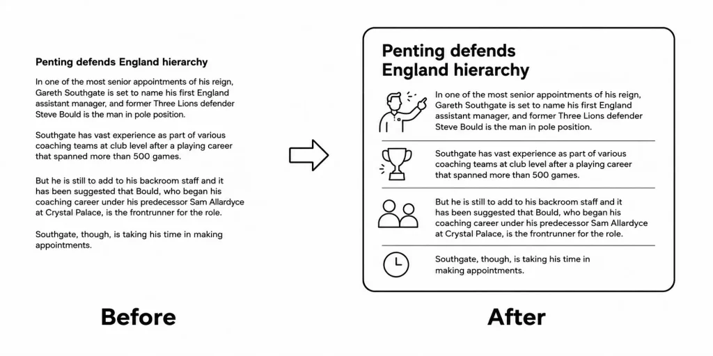
Telling clients what better e-learning looks like rarely works. Showing them usually does.
Take a boring piece of existing content and rework it. Build both versions. Put them side by side. Most clients have sat through enough bad courses to recognize the difference when they see it.
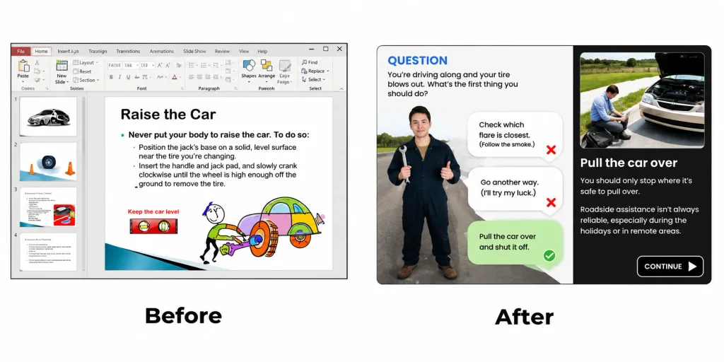
A before-and-after example does more to earn client trust than any proposal. It also positions you as an expert rather than an order taker. That distinction matters when you want to push for better work.
Google’s designers made more progress when they stayed connected with each other. The same is true in e-learning.
If you work in a large organization, find the other people doing similar work. I think this tends to be an issue for training where many organizations have main L&D teams that tend to wokr on personnel training and then an assortment of different production and sales and enablement teams.
Start or join an internal community. Some organizations run internal training conferences or regular meetups just for learning designers. The shared expertise from those connections compounds quickly.
If you don’t have internal peers, the online e-learning community fills that role. The people who stay connected to the field are the ones who keep getting better at it.
The parallels between design work at Google and e-learning design are closer than they look. Navigation, white space, client communication, and professional networks all show up in both worlds. The course designers who grow fastest are the ones who stay curious about how other fields solve similar problems. Keep collecting those cross-disciplinary insights. They’ll keep showing up in your work in ways you don’t expect.