Physical Address
304 North Cardinal St.
Dorchester Center, MA 02124
Physical Address
304 North Cardinal St.
Dorchester Center, MA 02124
Helpful ideas. Squeaky value.
Helpful ideas. Squeaky value.
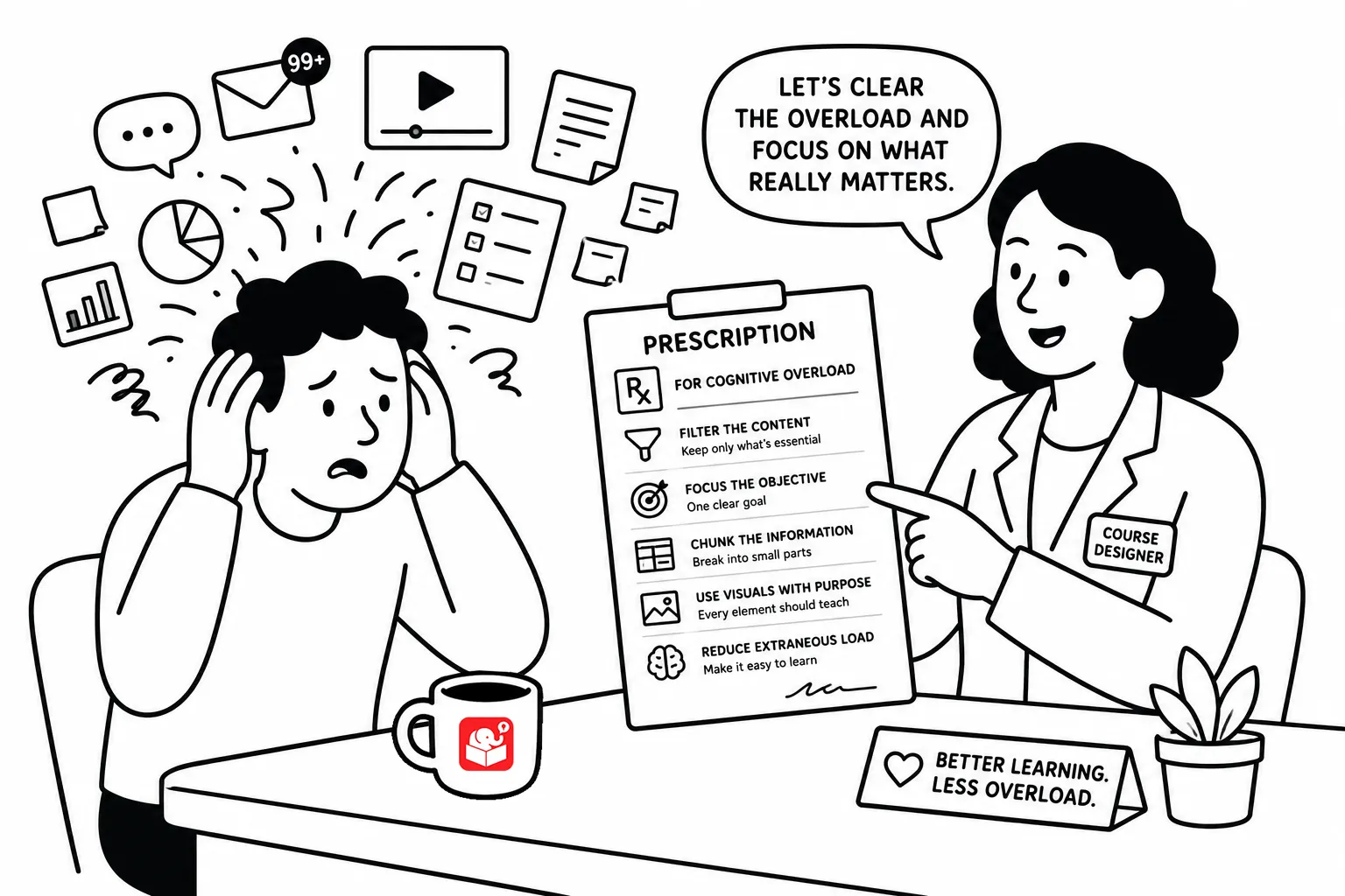
In a previous post, we looked What Every E-Learning Designer Needs to Know About Cognitive Load. Today, we’ll review some simple ways to consider it in your course design.
I once sat through a course that wasn’t long or complicated. The topic was simple. But by the end of it I felt like I’d run a mental marathon. There was too much on every screen, audio that repeated the text word for word, no clear structure anywhere. The content was fine. The design wore me out.
That’s cognitive load doing damage. And the good news is that most of it is fixable with small, deliberate choices. None of what I share below requires a design degree. It just requires paying attention to what you’re putting on the screen and why.
The most common mistake I see with new course designers is they tend to put everything on one screen. All the context, all the steps, all the exceptions. It feels thorough. To the learner, it feels like a wall.
Break your content into smaller pieces. I think one concept per screen is a reasonable target. Think about if, what difference does it make to see a screen with four bullet points or four screens with one point each?
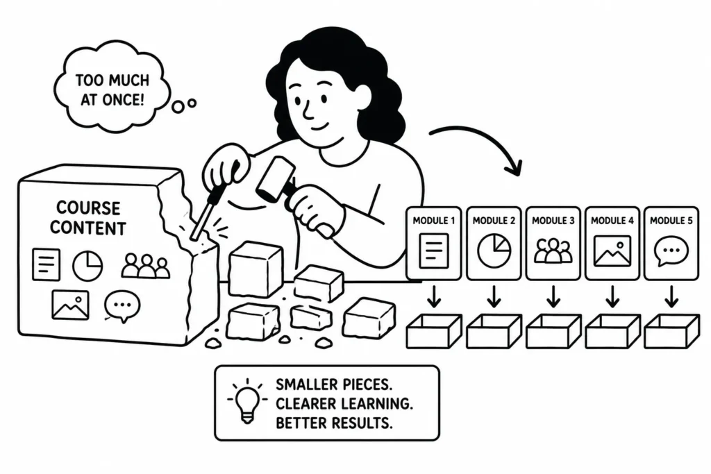
If you find yourself using a tiny font to fit everything in, that’s a signal you’re trying to do too much at once. The learner doesn’t need everything upfront. They need enough to move forward.
Related to that: don’t reveal everything at once. If a learner is on step two, they don’t need to see steps six through ten yet. I like to use progressive disclosure where I show what they need and then reveal the next piece of information. I don’t like to show everything at once, unless seeing everything at once provides important context. But then, I’d jump back and go through each piece individually.
Chunking information is good, too. Click-to-reveal interactions, tabs, and stepped layouts all do this well. The goal isn’t to hide information. It’s to not dump it all at the same time. That one shift alone can make a course feel significantly more manageable.
This one trips up a lot of people. When your narration reads the exact words on the screen, the learner is processing the same information twice through two different channels. It doesn’t reinforce the learning. It splits the attention and adds effort.
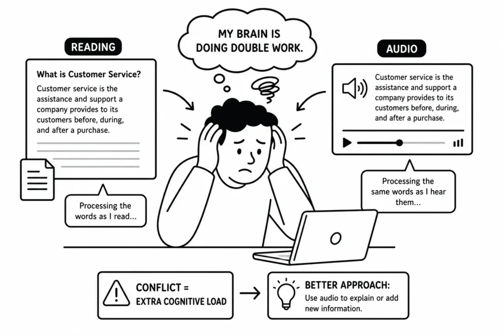
If you have narration, keep on-screen text short. Use it to support what’s being said, not repeat it. A relevant image or a single key phrase works better than a full paragraph sitting next to a voice track saying the same thing.
Every element on a screen competes for working memory. That includes the decorative stuff. Animated backgrounds, clip art that has nothing to do with the content, busy slide layouts with five font sizes. None of that helps the learner. It just adds noise.
Before you add anything to a screen, ask whether it helps the learner understand the content. If it doesn’t have a clear answer, leave it out. Simple, consistent layouts are easier to navigate and easier to learn from.
Learners spend mental energy figuring out how your course works. If every screen looks different, they’re spending effort on navigation instead of content. Consistent layouts, predictable controls, and clear headings reduce that overhead fast.
This doesn’t mean every screen needs to look identical. It means using the same patterns for the same types of content. When learners know what to expect, they can focus on what actually matters.
Pick one of these and apply it to something you’re working on right now. Look at a screen that feels crowded and cut it in half. Check whether your narration is repeating your on-screen text. Strip out one visual that doesn’t serve the content. You don’t have to redesign everything at once. Small changes add up. What’s the most common thing you see that overloads learners in a course? Drop it in the comments.