Physical Address
304 North Cardinal St.
Dorchester Center, MA 02124
Physical Address
304 North Cardinal St.
Dorchester Center, MA 02124
Helpful ideas. Squeaky value.
Helpful ideas. Squeaky value.

A subject matter expert once handed me a 300-slide deck and asked me to turn it into a course. My job was to figure out what was essential and what could go. That really used to be a pain, but with AI that is so much easier.
At it’s essence we’re trying to figure out the most important points of information that supports teaching to a specific objective. And when you think about it, that’s exactly what infographic designers do every day.
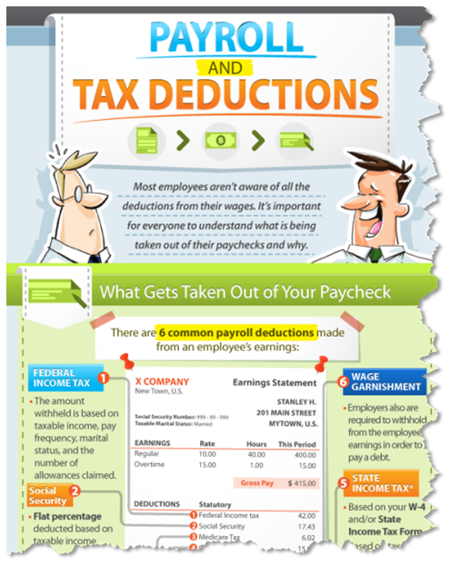
Think about the structure of a good infographic. Information is broken into specific sections, separated by color headers, and stacked in a single column.
Here’s an example of an older infographic that was a vertical design.
Compare that to a set of PowerPoint slides where I chunked the content to be slide-specific.
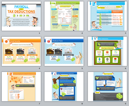
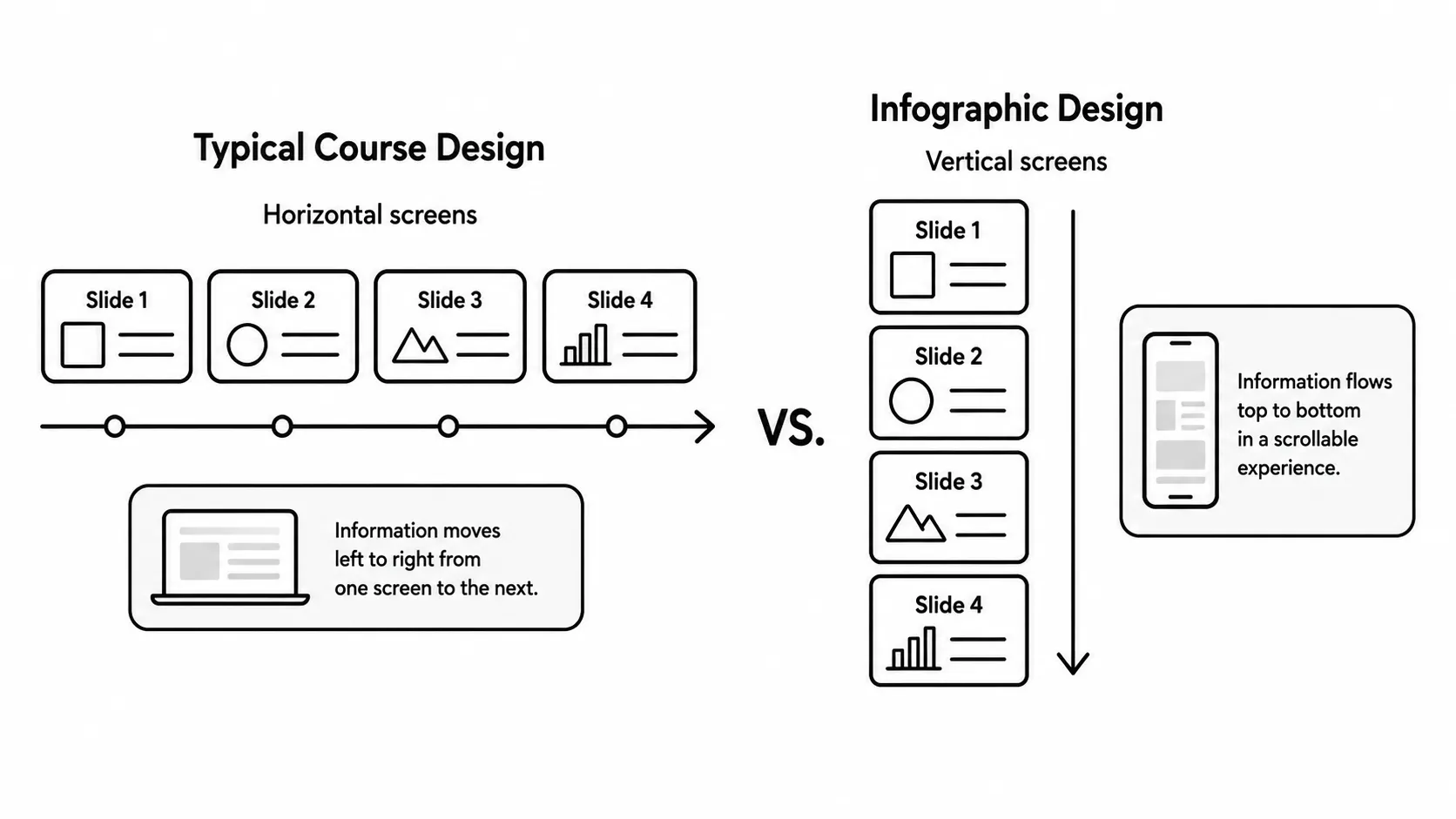
The layouts are almost identical. Instead of clicking forward horizontally through slides, with an infographic the viewer scrolls down vertically through sections.
The design logic is the same:
Once you see that parallel, infographics stop feeling like a separate discipline. They become a format you already understand.
The biggest lesson infographics teach is how to cut. Every good infographic starts with far more data than it uses. The designer’s job is to find the three or four points that actually matter and make those land.
E-learning tends to do the opposite. We pile in data because removing it feels like a risk. But too much information on a single screen competes with itself. The learner can’t tell what’s important because everything looks equally important.
Next time you’re working through a content-heavy screen, ask what one sentence captures the essential point. Let that sentence drive the visuals, not the other way around.
Good infographics let the data do the talking. If you need a paragraph to explain what the graphic means, the graphic isn’t working. The visual should make the point by itself.
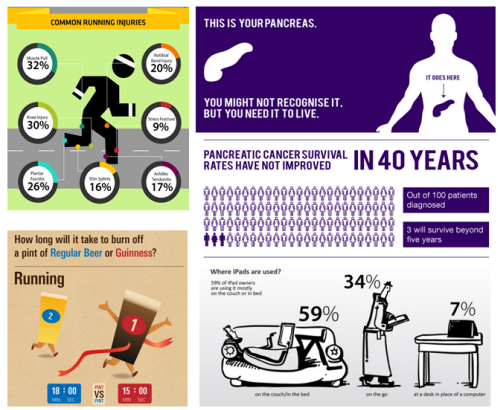
Applying this to e-learning means choosing visuals that reinforce the message, not just decorate the screen. A chart that’s hard to read is worse than no chart at all. A simple comparison that clicks immediately is worth more than a complex diagram that needs explanation.
Infographics use color deliberately. A background color sets the tone. A few accent colors create visual breaks between sections. The colors don’t compete with the information.
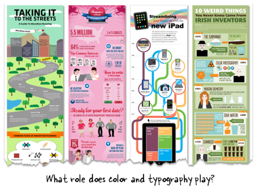
This is easy to apply to e-learning screens. Limit your palette to two or three colors and use them consistently to show structure. When a new section begins, a color shift signals the transition without needing a label.
Infographics treat fonts as graphic elements, not just text containers. A bold headline isn’t only bigger text. It establishes visual hierarchy and draws the eye.
E-learning screens benefit from the same thinking. Choose fonts intentionally. Use contrast between headline and body text sizes. Avoid more than two or three typefaces on the same screen. Typography is doing design work even when you don’t notice it.
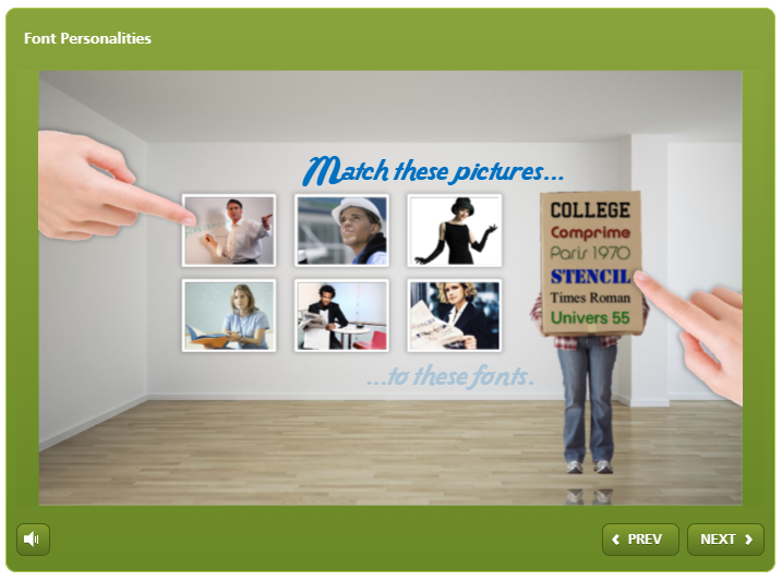
Check out this quick quiz about font personalities
Most infographics anchor each section with an icon. That visual hook makes the content more memorable and helps the eye navigate the screen.
You don’t need to be a graphic designer to do this. Free icon sets and vector libraries are widely available. The key is picking a single style and sticking to it. Mix too many styles and the screen looks fragmented. Stay within one visual language and it feels intentional.
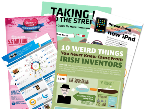
Infographics are worth studying regularly, even if you never plan to build one. They model the visual design thinking that makes e-learning screens work: cut aggressively, lead with what matters, and use color and type as structure tools. Here’s a good site with some examples.
Try building a simple infographic from your next content-heavy project. You might be surprised how much it changes how you see the material, and how you build the course around it.