Physical Address
304 North Cardinal St.
Dorchester Center, MA 02124
Physical Address
304 North Cardinal St.
Dorchester Center, MA 02124
Helpful ideas. Squeaky value.
Helpful ideas. Squeaky value.
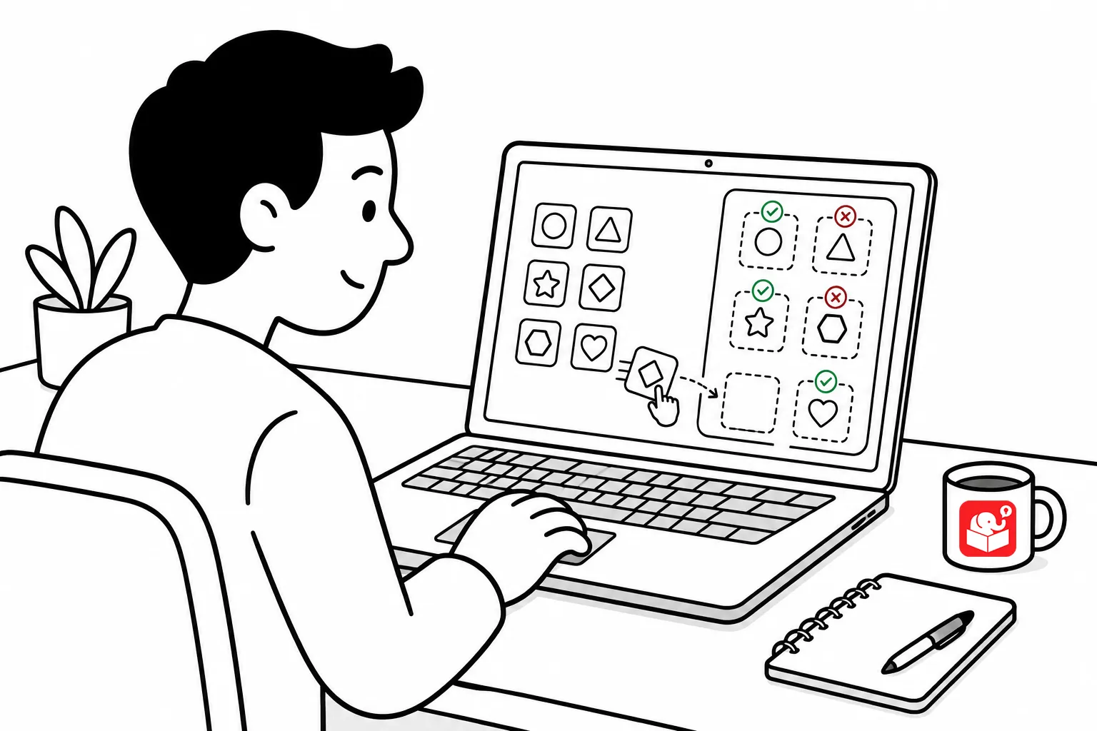
Drag and drop interactions work because they ask learners to do something. They pick up an object, make a judgment about where it belongs, and drop it in place. That decision-making is what makes the interaction worth building. But without clear feedback, learners don’t know whether their judgment was right.
Snap-to-target is the simplest feedback signal. When a learner drops an object on an acceptable target, it snaps into position. That physical alignment tells them the object landed where it should.
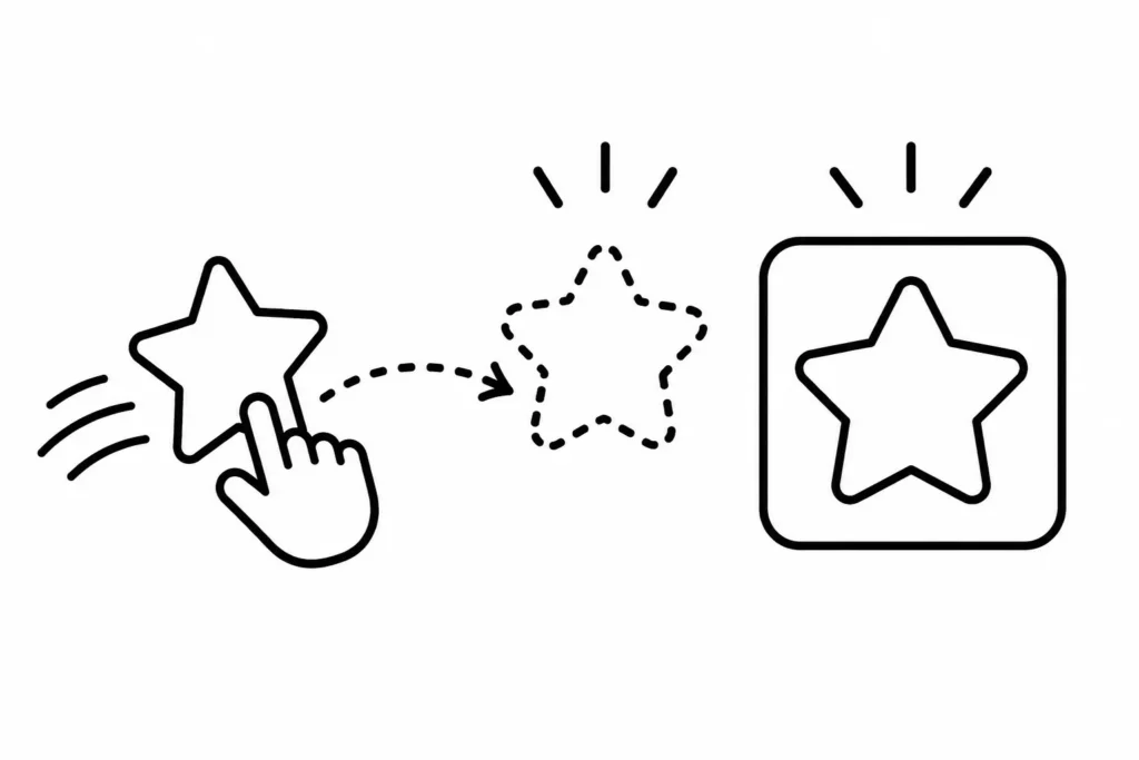
This is useful on its own, but it also solves a practical problem. Without snap, a learner might place an object correctly but not close enough for the tool to register it.
Snap removes that ambiguity and keeps the interaction from frustrating people for the wrong reason.
If you want correct/incorrect feedback without using a quiz feature, a clean option is to only accept correct placements during the drop activity. Incorrect drops simply return the object to its starting position.
The learner finds out they’re wrong without needing an explicit message.
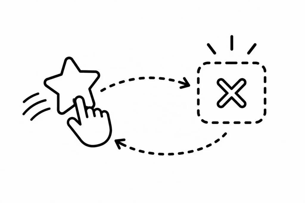
This works well for quick knowledge checks. It also makes a good opener for a new topic. Let learners make decisions before you dig into the content. The immediate feedback tells them where their thinking is off, which gives them something specific to pay attention to as they work through the lesson.
When an object lands on the correct target, change how it looks. A checkmark or an X is the most common approach. Color coding adds another layer: green for correct, red for incorrect. That gives a clear visual signal without requiring any extra clicks.
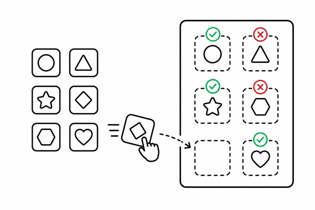
This approach lets learners see the full picture as they work through the interaction. They can track which choices were right and which need to be revisited. The feedback stays visible instead of disappearing after a single click.
The most elaborate thing is to add some sort of extra feedback like a box or modal (gate). They allow for more detailed feedback, but they do stop the interaction and puts feedback in front of the learner before they can move on.
You can use the authoring tool’s default feedback box, a custom layer, or a lightbox slide. The format matters less than the function. The point is to pause the experience and give learners time to process what just happened.
Gates do slow things down, so use them deliberately. They’re most useful at decision points where the feedback is important enough to warrant a pause. A gate at every step of a simple knowledge check will frustrate learners. A gate at a critical scenario decision gives them a moment to stop and think.
The right feedback approach depends on what the interaction is trying to do. A quick knowledge check at the start of a module pairs well with the return-to-origin approach. A high-stakes scenario decision calls for a gate. Visual state changes work any time you want ongoing feedback without interrupting flow. Think about what learners need to know, and when. Then choose the method that delivers that most clearly. Which of these four do you find yourself reaching for most often?