Physical Address
304 North Cardinal St.
Dorchester Center, MA 02124
Physical Address
304 North Cardinal St.
Dorchester Center, MA 02124
Helpful ideas. Squeaky value.
Helpful ideas. Squeaky value.
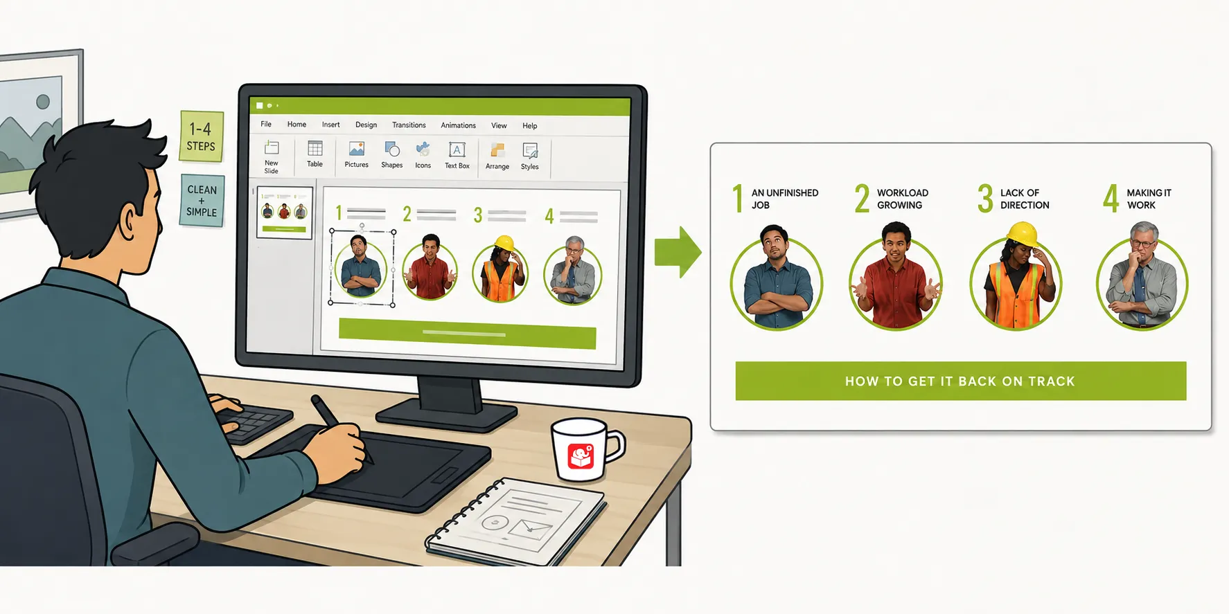
A while back, I shared a Rise interactive scenario and started getting emails asking how the graphics were built. The headers and flashcard images all came out of PowerPoint. Once you know the workflow, PowerPoint can handle almost any graphic you need without leaving a familiar tool.

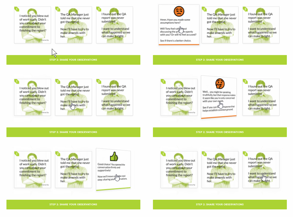
Rise offers a range of blocks that support inserted images, including image blocks, galleries, and interactive elements like flashcards. Most of them work best at one of two aspect ratios: 1:1 (square) or 16:9 (rectangle). A few blocks have text overlay and use decorative scaling, but the standard image blocks follow those two ratios consistently.
Knowing this up front saves a lot of trial and error. Build your graphics to those dimensions from the start and they’ll drop into Rise blocks without any cropping.
The key is to change the slide size before you start building. Go to Design, then Slide Size, and enter the dimensions you want. For a 1:1 graphic, set the slide to a square dimension. For 16:9, use standard widescreen proportions.
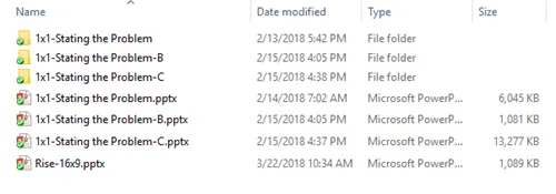
When you’re ready to export, go to Save As and choose an image format. PNG works best for most Rise graphics because it preserves clean edges and supports transparency. You can save a single slide or export all slides at once, which gives you a folder of ready-to-use images.
Because Rise uses two aspect ratios, I keep two PowerPoint files: one sized for 1:1 and one for 16:9. For the interactive scenario, the 1:1 file held all the flashcard graphics. One side of each flashcard showed the question with styled text and a character image. The other side showed the feedback.
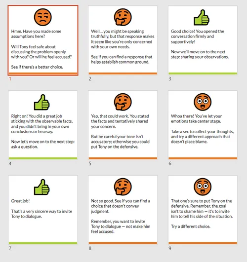
I used PowerPoint’s image editing features to colorize the graphics and add visual interest. The emoji feature in PowerPoint also works well for quick feedback icons without needing an external design tool. The results look polished without requiring anything outside of PowerPoint.
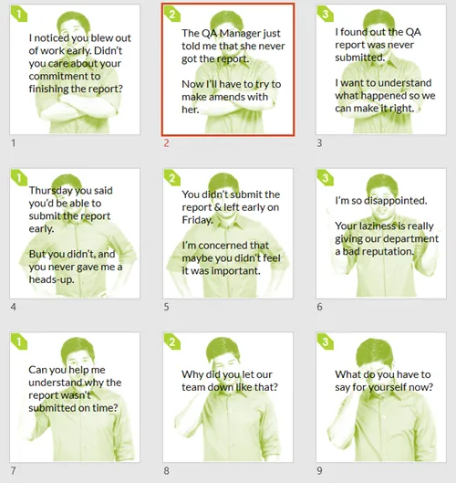
One of the header graphics used a more involved technique. The character extends above the top edge of the background shape. This creates depth and makes the graphic feel less flat.
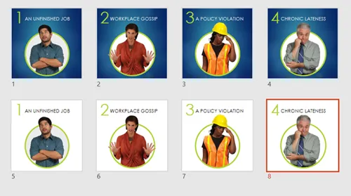
The process isn’t complicated. You can learn more here.
Place a background shape and size your character image to be taller than the shape. Position the character so the head and shoulders extend above the frame. Group the elements when you’re done so nothing shifts when you move the graphic. A lighter background version of this layout often works better in Rise because it keeps the overall screen feeling open.
If you have Articulate 360, Studio 360 is included and works inside PowerPoint. That means you have access to the full Content Library of characters and templates. Place any character on a slide, style it, and export as a PNG. It’s a straightforward way to keep your character art consistent across tools.
PowerPoint is an underrated graphics tool for course developers who already know it well. Setting up dedicated files at 1:1 and 16:9 gives you a reusable system for building Rise graphics quickly. As your library of graphics grows, you’ll spend less time building and more time designing the actual learning experience. What other graphics in your current courses could be rebuilt this way to give them a fresher look?