Physical Address
304 North Cardinal St.
Dorchester Center, MA 02124
Physical Address
304 North Cardinal St.
Dorchester Center, MA 02124
Helpful ideas. Squeaky value.
Helpful ideas. Squeaky value.
Visual design is important for your courses. Suppose you feel you don’t have the skills, so you do the bare minimum. You build a course that is black text and white background. Even though you didn’t put a lot of effort into it, it’s still looking like something.
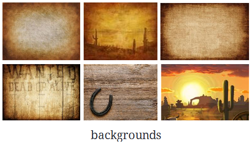
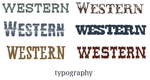
If I asked you to design a western movie poster. You may not know how to describe everything or maybe not even know how to build it, but you definitely have a mental picture of what it would look like.
You’d know right away if the fonts, colors, or characters felt wrong. That same gut reaction is what your learners bring to every e-learning course you build. And it’s what you can use to design the right look for your courses.
You don’t need a design degree to sense when something looks off. A children’s course with dark corporate fonts feels wrong. So does a safety course in pastel pink. That instinct is your visual voice. It draws on everything you’ve seen and absorbed over years of visual experience.
Let’s revisit the western movie poster. What colors come to mind? Most people picture dusty browns, warm tans, and faded golds. You may not know the right font’s name, but you’d recognize it instantly. The people on the poster? Cowboys, horses, maybe a wanted notice.

Now think about a Mafia movie poster. What comes to mind. For most people, black, white, and red tend to dominate. Change those colors to pastels with a soft script font and the whole feel of the movies shifts.
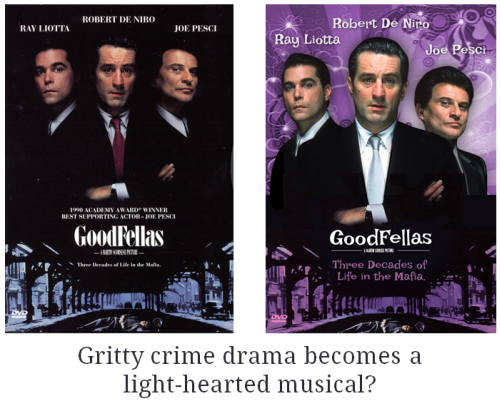
Your brain notices the mismatch before you can name it. That mismatch is the exact problem you want to avoid in e-learning.
A safety course looks different from a call center coaching course. Different colors, different character wardrobes, different image choices.
When the visual design matches the subject, learners feel oriented. When it doesn’t, something feels off and competes with the content.
Here are four things to identify before you start building:
You’re not aiming for perfection. You’re aiming for fit. A course that fits its subject looks more professional than a recycled template. If you’re stumped look at web template sites for inspiration. Or type a prompt into your AI chat. It’ll give you a good start.
Your visual voice is a practical design tool, not a creative luxury. The next time you start a project, run through those four questions before you open any software. Answering them early shapes every design decision that follows. What does your course need to look like to feel like it belongs?