Physical Address
304 North Cardinal St.
Dorchester Center, MA 02124
Physical Address
304 North Cardinal St.
Dorchester Center, MA 02124
Helpful ideas. Squeaky value.
Helpful ideas. Squeaky value.
Originally published: July 25, 2017
Original URL: https://blogs.articulate.com/rapid-elearning/visual-design-mistakes/
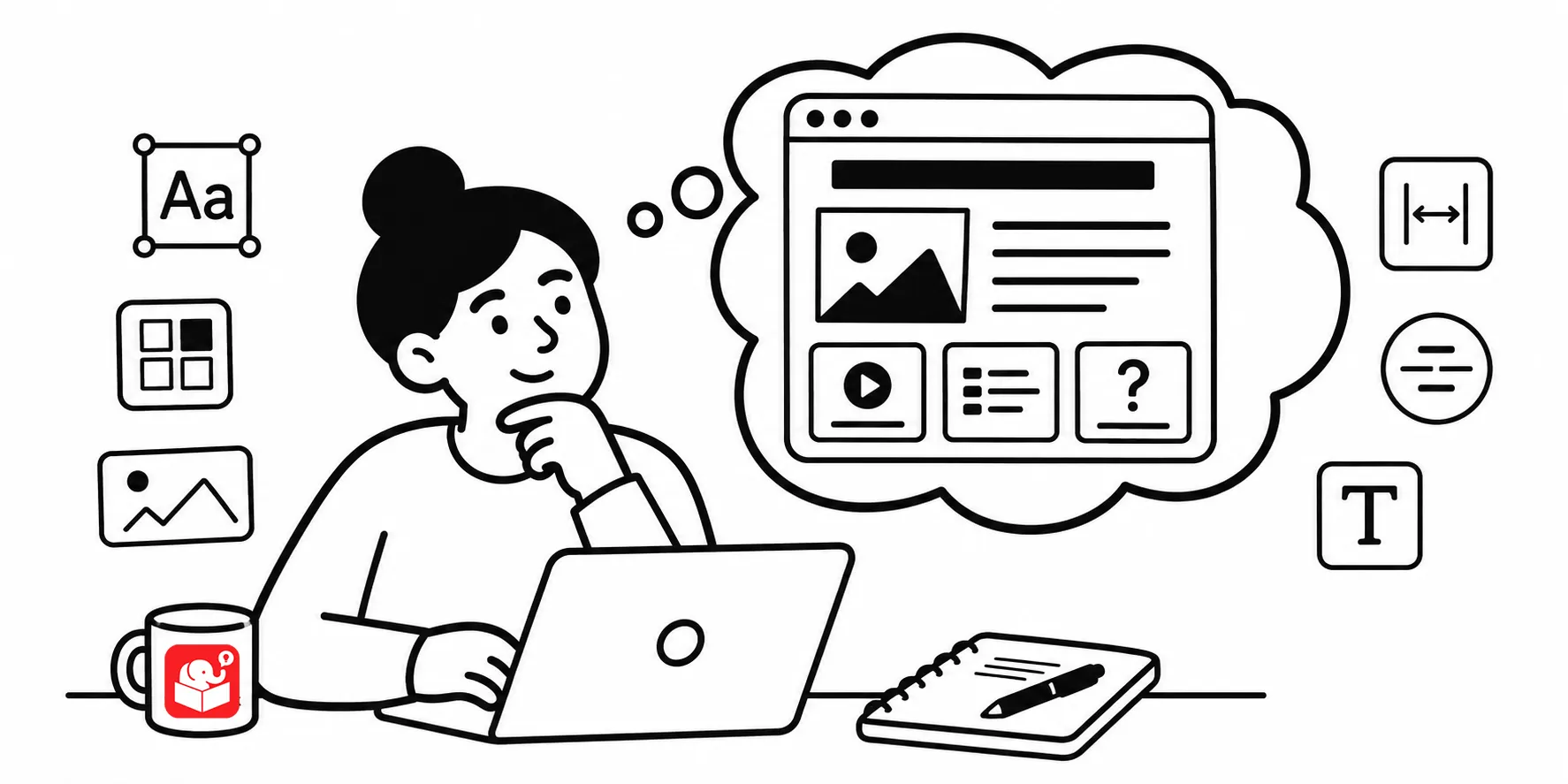
Picture a learner opening a course with solid, accurate content. The information is well-organized and relevant. But stretched images, mismatched fonts, and cluttered slides make it feel sloppy and hard to follow.
This is one of the most common mistakes, and it’s easy to fix. Someone inserts an image, then drags from a side handle to resize it. The result is a distorted image that looks slightly off or skewed.
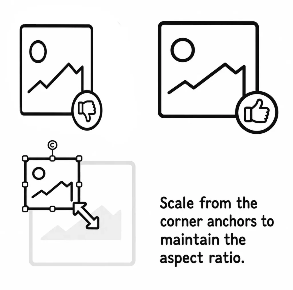
Always drag from a corner to scale an image. In most apps, holding Shift while you drag keeps the aspect ratio locked. The image stays proportional as you scale it.
Without a structured layout, the eye scans a screen in a Z pattern. It moves from top-left to top-right, then diagonally down. When every element on screen competes for attention, nothing wins.
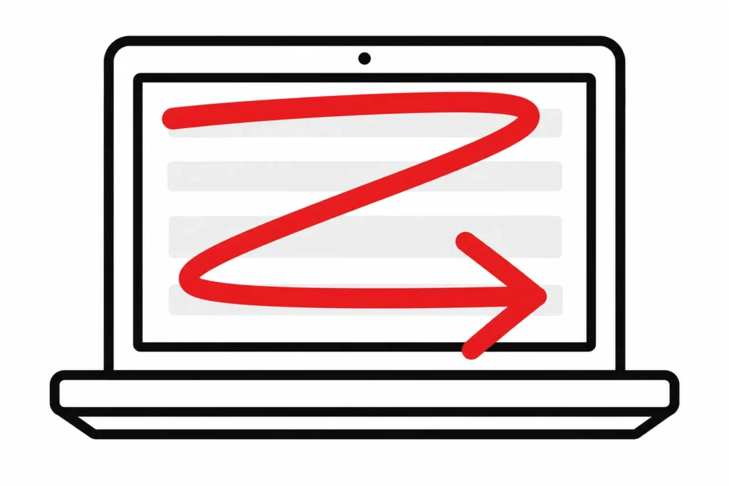
Two things help here.
This happens when you build slide by slide without a visual plan. One screen uses a serif font. The next uses a sans-serif. The result looks patchy and unfinished.
The solution is to decide on your visual style before you start building. A simple style guide defines your fonts, colors, and image style. It keeps everything consistent from the first screen to the last.
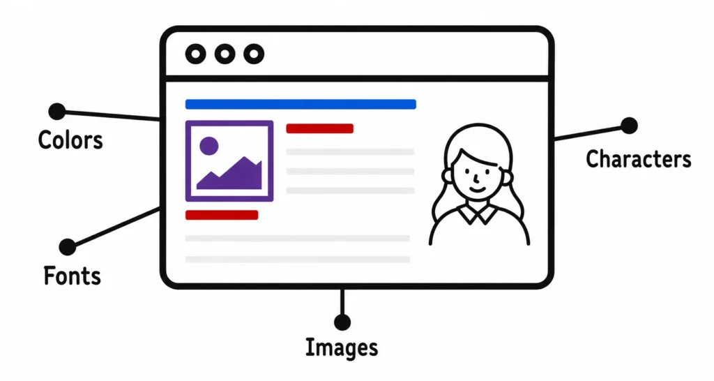
The most common signs of inconsistency include:
When every piece of text looks the same size and weight, learners can’t tell what matters most. There’s no visual signal to guide their eyes or show how ideas relate to each other.
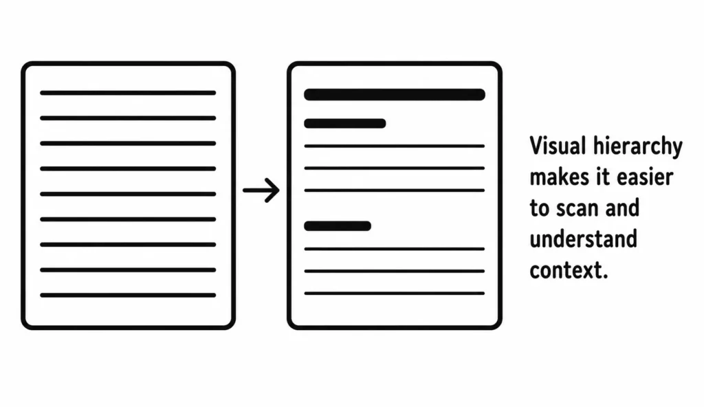
A style guide that defines heading, subheading, and body text styles solves this right away. Visual hierarchy lets learners chunk content and understand context without extra effort.
Think about walking into a room where the furniture is slightly off-center and the pictures hang at different angles. You can feel the imbalance even if you can’t name it. The same thing happens when onscreen objects aren’t aligned properly.
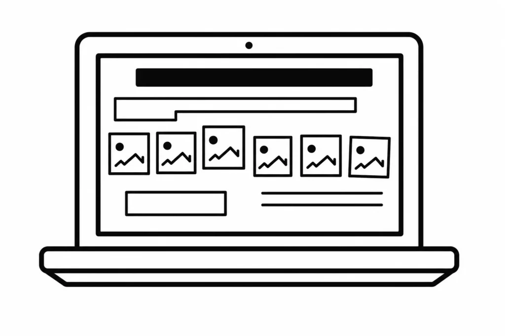
A few habits fix this quickly:
These fixes won’t turn you into a graphic designer overnight. But they’ll help you build courses that feel intentional and polished. The bigger shift is developing the habit of making visual decisions before you start building. When design choices lead the work rather than chase it, everything goes faster.