Physical Address
304 North Cardinal St.
Dorchester Center, MA 02124
Physical Address
304 North Cardinal St.
Dorchester Center, MA 02124
Helpful ideas. Squeaky value.
Helpful ideas. Squeaky value.
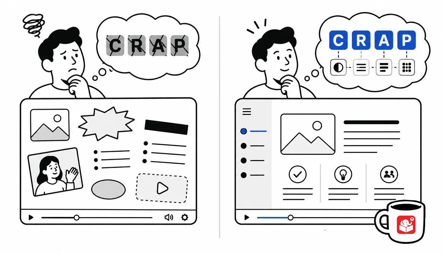
I get asked a lot how to make courses look more professional. People assume it takes an eye for design or years of graphic design training. It doesn’t. Well, a trained eye for design, which we’ll cover in this post.
Most of what separates a cluttered course from a clean one comes down to four simple principles.
Designer Robin Williams (not the actor) laid them out in a few years ago in one of the best resources a course designer could own: The Non-Designer’s Design Book, and the acronym stuck for a reason.
If you only remember one design framework from this blog, make it this one.
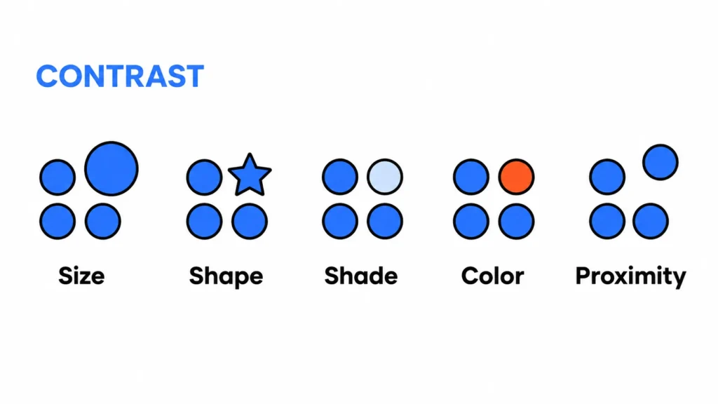
Contrast means elements that aren’t the same should look clearly different. If two things aren’t equal in importance, don’t make them look equal on screen. Use size, color, or weight to show the difference.
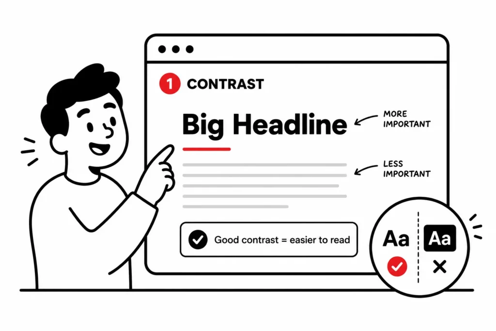
A bold headline next to regular body text is contrast doing its job. Contrast also does double duty for accessibility, since it’s what makes text readable against its background.
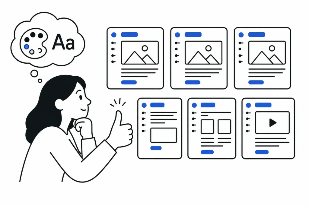
Repetition means reusing the same fonts, colors, and layout choices throughout the course. Repetition is what makes a course feel like one course instead of twenty different screens someone slapped together. Pick a color palette and a couple of fonts, then stick with them.
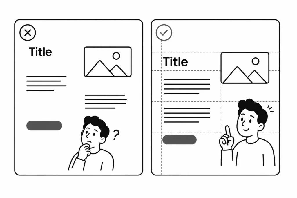
Alignment means every object on screen connects to something else through an invisible line. Nothing should be placed arbitrarily. When you align text boxes, images, and buttons to a shared edge, the screen feels intentional instead of scattered.
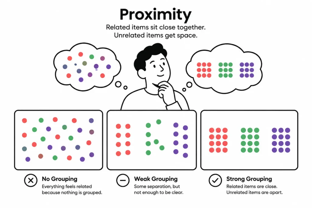
Proximity means related items sit close together, and unrelated items get some space between them. Grouping is how learners figure out what belongs together without you having to explain it. A caption glued to its image and separated from the next block of text is proximity at work.
None of this is decoration.
Put together, these four principles do the visual thinking for your learner so their brain can focus on the content instead of decoding the layout.
These principles show up wherever you’re making a placement decision: where text sits relative to an image, how much space you leave around a button, whether a headline is bold enough to signal it’s a headline.
Every screen in your course is a series of these small decisions. Apply CRAP consistently and the whole course feels like it was built with intention, even if you built it on a lunch break.
This is where it gets practical, because the tool you’re using changes how much of this work is on you.
Storyline is freeform. You get a blank slide and you place every object yourself: images, text boxes, buttons, all of it. That freedom is great, but it means all four CRAP principles are entirely your responsibility.
Nothing aligns unless you align it. Nothing repeats unless you build a template and reuse it. If you’re sloppy, it shows immediately, because there’s nothing stopping you from dropping a text box wherever you feel like.
Rise is form-based. You’re not placing objects on a blank canvas, you’re filling in pre-built blocks. That constraint is a gift for CRAP. Rise already handles most of the alignment and repetition for you: the blocks are consistent, the spacing is baked in, the fonts are set by your theme.
Your job shrinks down to choosing good contrast (text color against the block background, image choice) and letting proximity happen naturally because content within a block stays grouped.
The one place Rise hands the freeform problem back to you is the custom block. The second you open a custom block, you’re back in a blank, freeform space (unless you use a template) and all four principles are on you again, same as Storyline. So learn to treat the custom block with the same discipline you’d use in Storyline: set a grid in your head, align to it, and leave consistent padding.
Bottom line: form-based tools like Rise do a lot of the CRAP work for you through constraints. Freeform tools like Storyline (and Rise custom blocks) put it all in your hands. Neither is better, but you need to know which mode you’re in.
AI is useful here, but it doesn’t replace knowing the principles, it just speeds up applying them. A few ways I use it:
The catch: AI-generated images from different prompts or sessions tend to drift in style, which breaks repetition fast. And AI has no idea what your course needs contrasted against what, that’s still a judgment call only you can make.
Know the four principles first, then use AI to execute faster. Skip the principles and you’ll just get a faster way to build something that looks like crap. So you can go from crap to CRAP or CRAP to crap.