Physical Address
304 North Cardinal St.
Dorchester Center, MA 02124
Physical Address
304 North Cardinal St.
Dorchester Center, MA 02124
Helpful ideas. Squeaky value.
Helpful ideas. Squeaky value.
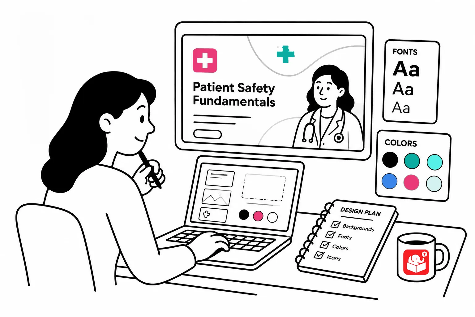
A lot of e-learning developers start building before they’ve thought about the visual design. They pick a template and add images that seem to fit each screen. Without a clear plan, the course ends up with a discordant look.
Here’s a real example. I was building a demo and decided to search for photo frame pictures on a stock photo site. That led me to a Polaroid idea, which led me to image packs with burned filmstrips. The packs were great: a few dollars, a consistent style, a polished set of screens.
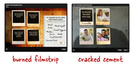
But then I added more content to the demo. The burned filmstrip images didn’t work with the earthquake subject matter. The look was visually rich but contextually wrong. My mistaked was that I let the images drive the design instead of the other way around.
That’s the trap. You waste time searching (or creating with AI) and you still end up with something that doesn’t fit.
E-learning is mostly a visual medium. A well-chosen visual design puts the learner in the same mental space as the content. I call this a visually immersive experience.
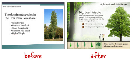
In our workshops, we use a demo based on the Hoh Rain Forest. The goal is to make the learner feel like they’re stepping into the forest. We start with a rain forest background image, then add elements that fit the environment.
The before and after is striking, and none of it requires advanced design skills.
When I swapped the burned filmstrip background in my earthquake demo for a cracked cement image, the whole course changed. The design matched the content. That’s what you’re going for.
Getting the look right doesn’t require starting over every time. A few habits applied consistently make a big difference.
The next time you start a course, spend a few minutes on the visual concept first. Ask what the content looks like and where the learner needs to feel they are. That question will point you to the right background, the right palette, and the right overall direction. A little planning upfront replaces a lot of aimless searching.