Physical Address
304 North Cardinal St.
Dorchester Center, MA 02124
Physical Address
304 North Cardinal St.
Dorchester Center, MA 02124
Helpful ideas. Squeaky value.
Helpful ideas. Squeaky value.
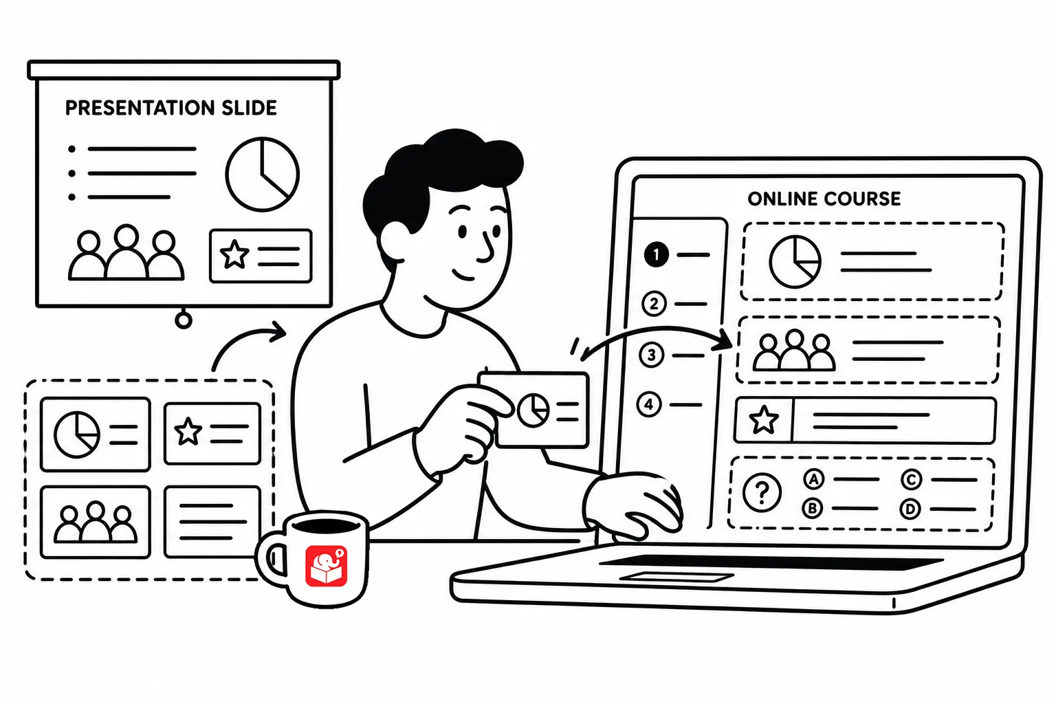
Many course builders know their courses could look better. It’s one of the most frequent questions I get. The harder question is what to do about it when you’re working fast, your subject matter expert wants everything included, and your client just wants it done.
Garr Reynolds of Presentation Zen once compared a presentation by Bill Gates to one by Steve Jobs and argued that the Jobs approach was more effective. Looking at them side by side, it’s easy to see why. The Jobs slides had one idea at a time. They were visually clean. They didn’t make the viewer work to figure out what mattered.
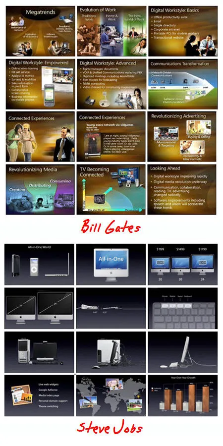
That approach isn’t just easier to look at. It’s easier to learn from. When a screen is cluttered with text, the learner’s brain has to sort through it all while also trying to understand it. That sorting takes up cognitive capacity that could have gone toward actual learning. Simpler screens free up mental space for processing.
The goal isn’t to remove information. It’s to present information in a way that the brain can handle without getting overloaded.
Cliff Atkinson, who wrote Beyond Bullet Points, makes a useful point about screen headings. A vague heading like “Key Information” makes the learner work to connect it to everything below it.
However, a specific, clear heading does the opposite. It signals what the learner is about to encounter and gives the brain something to organize the incoming information around.

That’s a small design decision with a big impact. If your headings are just labels, you’re adding cognitive load. If your headings are specific and meaningful, you’re reducing it.
One reason why Steve Jobs’ approach works so well in a live presentation is that the audience can’t rewind. When you remove text from slides, the speaker’s words carry the content. That works in a room but can be risky in a self-paced course where learners might miss something and have no way to recover it.
In e-learning, you have flexibility that presentations don’t offer. Learners can pause, rewind, and retake the course. You can build in assessments that identify gaps and route learners back to relevant content. That changes how you balance on-screen text and narration. You don’t have to choose one or the other. You have room to design a combination that works for your learners.
The principles behind the Jobs approach translate directly to e-learning design, and they don’t require a design background to apply.
Progressive disclosure is the first one. Reveal information as learners need it rather than presenting everything at once. Animations that introduce elements one at a time give the brain time to process each piece before the next one appears.
The second is condensing on-screen text. Strip down what appears on screen to the essential points. The narration or supporting text can carry the full explanation. The screen handles the signal; the narration handles the detail.
The third is replacing text with relevant images. A well-chosen image communicates faster than a bulleted list and gives the brain a visual anchor to organize what it hears. Images work best when they directly support the concept, not when they decorate the screen.
Pull up your most recent course and look at it slide by slide. For each screen, ask whether everything on it is carrying its weight. If a word, bullet, or image isn’t helping the learner understand or remember the content, consider removing it. The screen you end up with might look sparse, but sparse and clear beats dense and forgettable every time.