Physical Address
304 North Cardinal St.
Dorchester Center, MA 02124
Physical Address
304 North Cardinal St.
Dorchester Center, MA 02124
Helpful ideas. Squeaky value.
Helpful ideas. Squeaky value.

Research shows that pairing images with text is more effective than text alone. The catch is that the images have to be the right ones. The same research also shows that irrelevant images can increase cognitive load and make it harder for learners to retain information. This isn’t a small distinction. It means that a bad image isn’t neutral. It actively works against learning.
The strongest images in an e-learning course do something text can’t do as quickly: they hook the learner emotionally or shift their perspective. A single image can establish context, create tension, or make an abstract idea concrete before a word of narration has played.

Think about the images you’ve seen in effective courses. They weren’t just illustrative. They communicated something on their own. When you choose an image for your course, test it against that standard. Can it carry part of the content without a caption? Does it add meaning or just fill space?
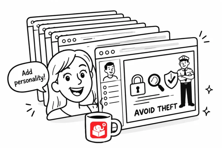
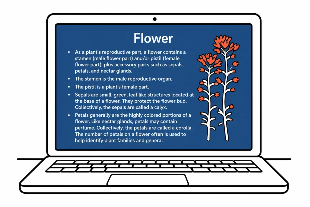
Look at the image below which is a typical bullet point screen. Compare it to the next one.

Taking an idea that’s currently expressed as bullet points and converting it into a single image with concise text changes how learners experience the information. It becomes visual and memorable instead of another thing to read and forget.
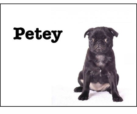
These two images come from the “Meet Henry” presentation. Spend some time studying how the designer of the slides used images and minimal text to convey key points of information.
Even a strong image can mislead if learners aren’t guided toward what to look at. Without context, learners bring their own interpretations, which may have nothing to do with your learning objective.
A photograph can tell completely different stories depending on what you tell the learner to notice. The same image can support a lesson on workplace safety, communication styles, or customer service depending on how it’s framed. The framing is your job.
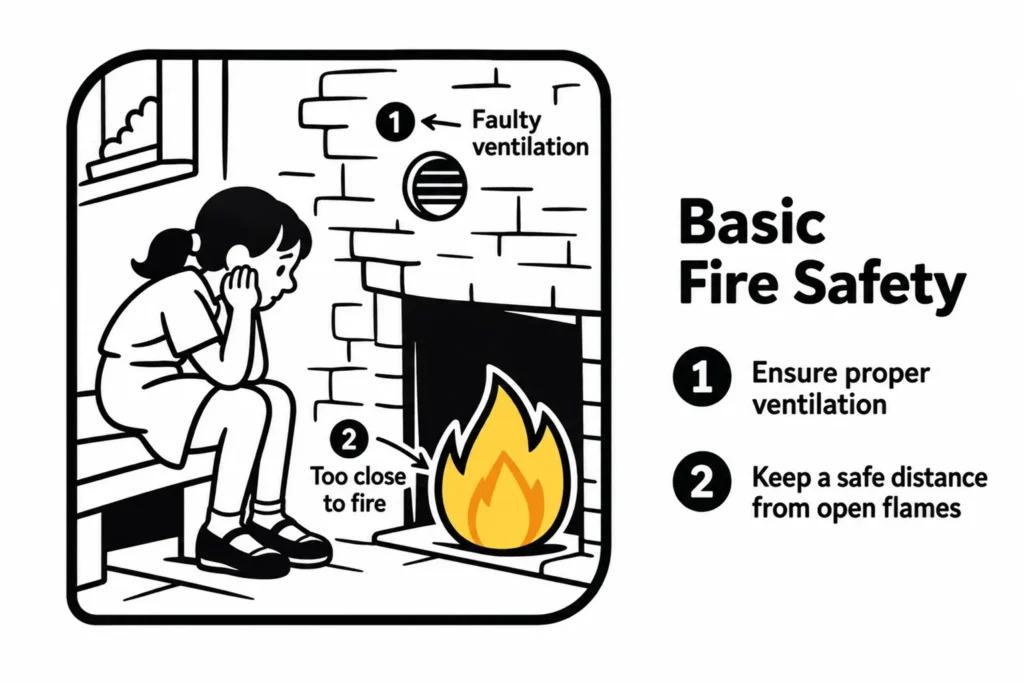
Point learners toward the relevant part of the image. Label what matters. If the image shows a process, a diagram, or a real scenario, tell learners explicitly what they’re looking at and why it connects to the content. Don’t make them figure it out.
The most common image problem in e-learning is decoration. A clip art person standing next to a bullet point list doesn’t help anyone learn anything. It adds visual noise, takes up screen space, and can actually pull attention away from what matters.
The test for any image is whether removing it would make the screen less clear. If it wouldn’t, remove it. Every image on a screen should be doing work. It should illustrate a concept, provide context, show a process, or anchor a scenario. If it’s there because the screen looked too plain without it, that’s a design problem to solve a different way.
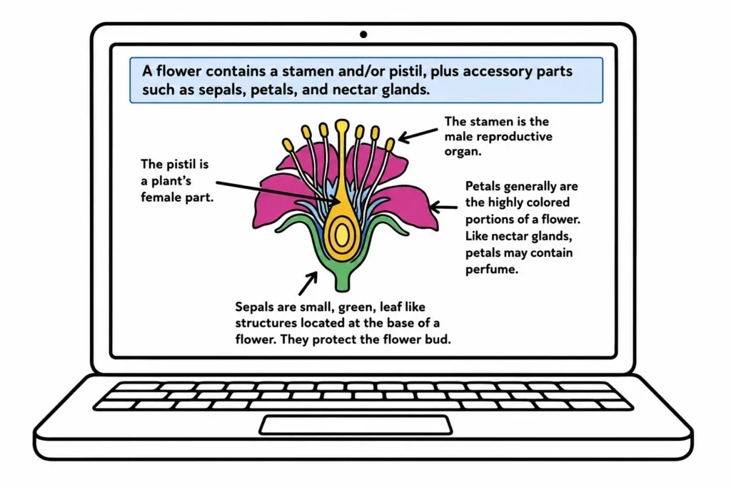
Compare a bullet list next to a stock photo to the same list converted into a diagram that shows how the pieces relate. The second version uses the same content but makes the relationship between ideas visible. That’s an image doing its job.
While these are all simple examples, they’re important reminders about how to use imagery in your courses.
Before you drop an image into your next course, ask three questions:
If the answer to the third question is “easier,” the image doesn’t belong there. The goal isn’t a visually busy course. It’s a visually clear one.