Physical Address
304 North Cardinal St.
Dorchester Center, MA 02124
Physical Address
304 North Cardinal St.
Dorchester Center, MA 02124
Helpful ideas. Squeaky value.
Helpful ideas. Squeaky value.

A slide with six different colors, two stock photo backgrounds, and three font colors is doing too much. The eye doesn’t know where to look, so it doesn’t look anywhere in particular. Two simple techniques can calm all that noise and make your content easier to follow.
I saw these examples from a weekly challenge we did a while back.
The idea is straightforward. Strip all color from your background image by converting it to greyscale. Then pick one accent color and apply it to your most important elements.
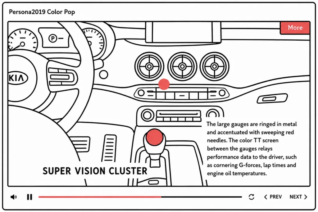
To make this work:
The effect is immediate. Greyscale backgrounds stop competing with your content. The accent color pops because there’s nothing else fighting for attention. This approach works well for labeled diagrams, product demos, and any slide where you need learners to follow a sequence.
This one is more eye-catching. It works best for title slides, key-point callouts, or moments where you need a strong visual impression.
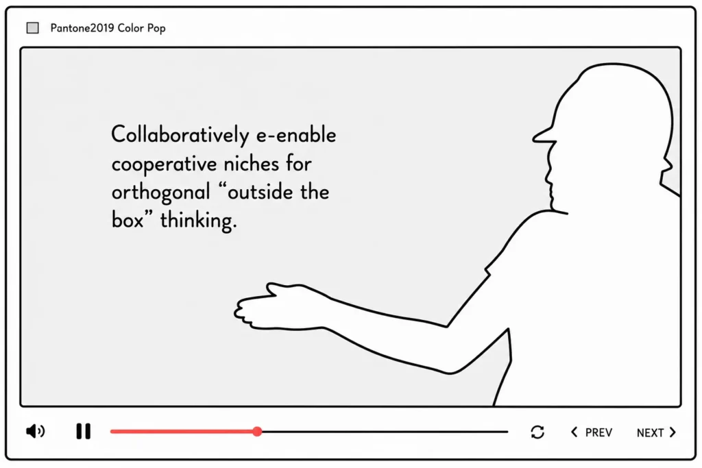
Silhouettes are easy to create from any character or object image:
One advantage of silhouettes over full-color photos is ambiguity. A silhouette of a person doesn’t have a specific race, age, or gender. That makes it a flexible choice for inclusive imagery. And it works if you have good images but bad quality or inconsistent lighting.
These two techniques are worth keeping in your regular rotation, not just for special occasions. Greyscale-plus-accent works on almost any slide that has a photo background. Silhouettes work best in small doses. Try applying one of them to your next slide deck and see if the hierarchy becomes clearer.