Physical Address
304 North Cardinal St.
Dorchester Center, MA 02124
Physical Address
304 North Cardinal St.
Dorchester Center, MA 02124
Helpful ideas. Squeaky value.
Helpful ideas. Squeaky value.

When a learner looks at your slide, they’re already making inferences. The way elements are spaced, grouped, and styled communicates meaning before a word is read. You’re either using that to your advantage or working against it. Here are three principles that help.
Proximity tells learners what belongs together. Objects that are close to each other look related. Objects that are far apart look unrelated. This happens automatically, before the learner reads anything.
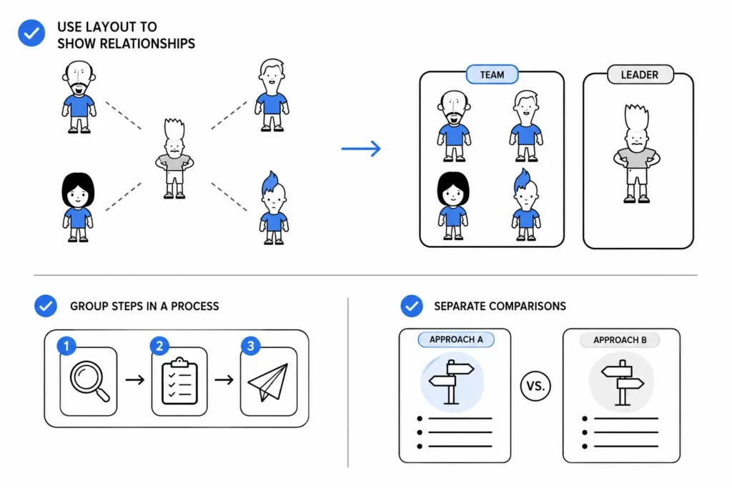
You can use that to your advantage. If you’re introducing a process with three connected steps, group them visually. If you’re comparing two different approaches, give them distinct spaces on the screen. The layout does some of the explaining before you write a single word.
Learners are pattern-recognizers. Once they understand that bold text means a section heading and underlined text means a key term, they’ll start scanning for those patterns automatically. That makes the content easier to process.
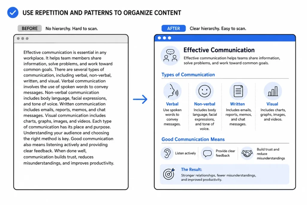
This works with visual elements too, not just text formatting. A consistent icon style, a repeated color treatment, a predictable layout structure across slides — all of it signals to the learner how information is organized. Build those patterns deliberately and they’ll reduce cognitive load throughout the course.
Every image on the screen tells the learner something. There’s a tendency for some course designers to put decorative images on the screen to fill in blank spots. Or sometimes, the client wants to “jazz things up a bit.”
Avoid that. Don’t litter the screen with useless elements. If a picture is there for decoration or to “fill in the blank space,” it’s still sending a signal. And if that signal doesn’t match the learning objective, you’re adding noise.
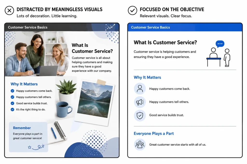
Some research suggests that decorative images can actually hurt learning by pulling attention away from the content that matters. A photo of smiling people in an office might feel friendly, but if it has nothing to do with the content on that screen, it’s a distraction. Every visual element should earn its place.
Pick the principle that’s weakest in your current work and focus there. If your screens feel cluttered, start with proximity and group what belongs together and space out what doesn’t. If your courses feel inconsistent, work on repetition and establish a pattern system. If your images feel random, audit them one by one and cut anything that doesn’t serve the objective.
You don’t need to be a designer to apply these. You just need to look at each screen and ask whether every element is doing its job.