Physical Address
304 North Cardinal St.
Dorchester Center, MA 02124
Physical Address
304 North Cardinal St.
Dorchester Center, MA 02124
Helpful ideas. Squeaky value.
Helpful ideas. Squeaky value.
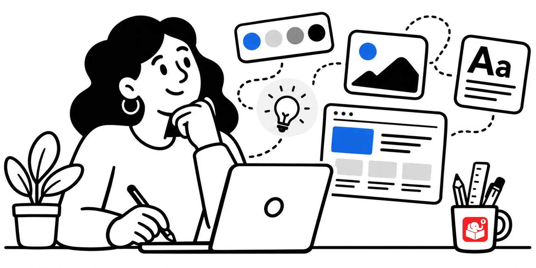
A colleague once showed me a course she’d built. The content was solid. The objectives were clear. But the layout was a mess with misaligned text boxes, three different font sizes, stock photos that clashed with the icons. She knew it looked off. She just didn’t know why, or how to fix it.
E-learning is a visual medium. Even a white background with black text is a design decision. You made it whether you thought about it or not.
People who create e-learning lean well into instructional designer. But many of us have shaky design instincts. That’s not a knock, it’s just the way things are. Grraphic design is a whole different industry and full time job.
The challenge for us is that whether we have good skills or not, the course has to look like something. I’ll say something a little controversial: I’d rather have a good-looking bad course than a bad-looking bad course.
Good visual design sets a tone. It signals to learners that someone took this seriously, before they’ve read a single word.
You don’t need to know everything about graphic design. But a handful of core principles show up again and again in every course worth looking at.

Here they are, with a quick take on each:
AI image and design tools have changed a lot for people who aren’t graphic artists. If you’ve struggled to find the right background image or build a custom illustration, AI can handle more of that work now. That part is real.

Here’s something worth knowing, though. AI output tends to drift the longer you work in a single session. Ask for five variations of the same image in one chat and the quality starts to slip. Another issue is that AI often gives you something that looks generic. It’s hard to describe but easy to spot. We’ve all seen the same type of graphics in all sorts of AI slop.
The fix isn’t to stop using AI. It’s to build enough of a design foundation that you can tell when the output is drifting. That means starting fresh sessions, writing more specific prompts, and pushing back when something looks off. You can’t do any of that without knowing what good contrast, alignment, or hierarchy actually look like.
For designers who aren’t designers, The Non-Designer’s Design Book by Robin Williams is the place to start. I’ve recommended it for years and I keep recommending it. Contrast, repetition, alignment, proximity — these aren’t trends. They’re the foundation.
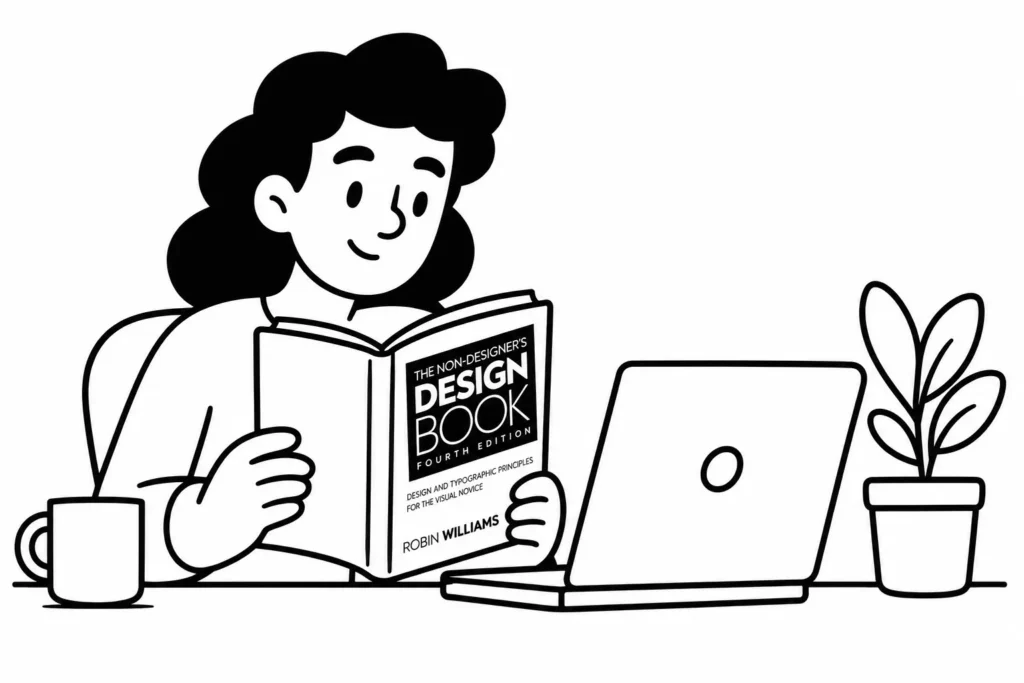
Whether you’re building a course from scratch or prompting AI to generate assets, this book gives you the vocabulary and the eye to do it well. It’s short, practical, and written for people who came up through a different field entirely.
Pick up The Non-Designer’s Design Book if you haven’t — it’s a quick read and it pays off fast. Then take your next course and focus on just one principle: notice your contrast, check your alignment, or look at whether your graphics hold together as a set. AI can handle more production work now, but the judgment calls still belong to you. Build the eye, and the tools get a lot more useful.