Physical Address
304 North Cardinal St.
Dorchester Center, MA 02124
Physical Address
304 North Cardinal St.
Dorchester Center, MA 02124
Helpful ideas. Squeaky value.
Helpful ideas. Squeaky value.
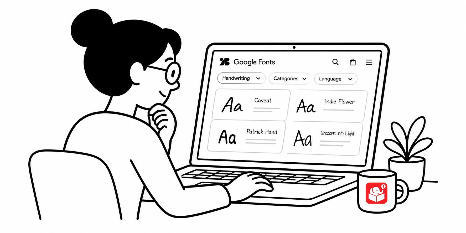
The question I get asked often is “What font is that?”
It comes up almost every time I use a handwritten font in a course. That’s not an accident. Handwritten fonts stand out because they’re different. Most digital content uses the same handful of clean, legible, professional typefaces.
A handwritten font signals something different. It feels personal. It feels made by a human.
That matters more than people realize. When every course in a training library uses the same Calibri or Poppins type treatment, learners tune out the visual presentation without thinking about it.
A different font type, used consistently and with intention, can shift that response.
Most developers are stuck with what comes installed on their computer. When they want something less formal, the default option is Comic Sans, which is both universally available and universally disliked. That’s not much of a choice.
Several sites offer fonts that are truly free for commercial use. Here are a few:
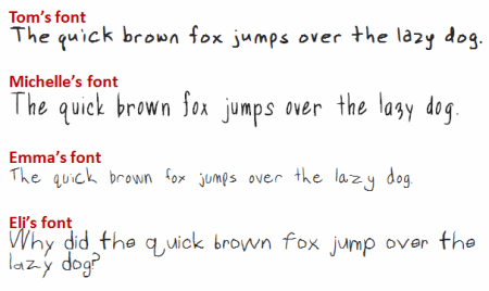
One filter worth applying when evaluating a handwritten font: does it have enough characters and symbols to work through a full course? Some free fonts are missing common punctuation or numbers, which creates problems at the worst possible moment.
Some font creation tools generate fonts with built-in licensing restrictions that prevent embedding in Office files. When you share files test the embedding before committing to it. If embedding fails, convert text to outlines or use a different format.
Next time you’re building a course that needs warmth or a personal touch, look at your font choice first. A handwritten font, applied consistently, costs nothing and can change how the whole course feels. Start with a font site, spend fifteen minutes testing a few options in your slide template, and see which one fits the tone you’re going for.