Physical Address
304 North Cardinal St.
Dorchester Center, MA 02124
Physical Address
304 North Cardinal St.
Dorchester Center, MA 02124
Helpful ideas. Squeaky value.
Helpful ideas. Squeaky value.

A student intern showed me his first e-learning course. He did a solid job for someone just starting out, but made five visual design mistakes I see in a lot of courses I review. They’re easy to make and just as easy to fix once you know what to look for.
Everything on the screen tells a story. What you put there, where you place it, how it looks. It all adds to a message whether you planned it that way or not.
Think about companies like Apple. They build good products and tell a consistent visual story around them. There’s no accident in how their product packaging, advertising, and website all feel like they belong together. The experience is intentional.
Your course works the same way. The visual design sets the tone. It should be intentional. If you’re not making deliberate choices, the screen still communicates something. You just don’t get to decide what it is communicating. But you can.
Your course has a central idea. The visual design should support it. That means consistent element placement, recognizable patterns, and a sense of order the learner can anticipate.
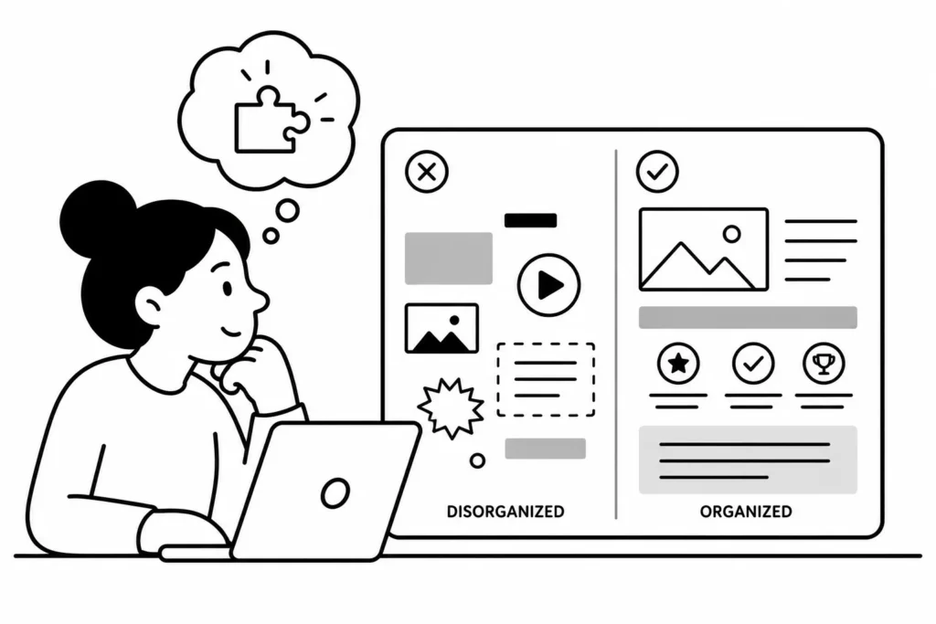
Many web designers use a grid structure to plan page layout. The same principle works for e-learning. Plan your PowerPoint template on a grid. Decide where content goes before you start adding elements to slides. A grid makes consistency almost automatic, which keeps learners focused on the content rather than the layout.
The intern’s course had nice photos throughout. But he mixed in some vector clip art in a few spots. The images weren’t random choices. They just didn’t look like they belonged in the same course.

Your graphics have two jobs: support the content and fit the visual style of the course. Both matter. Mixing photo styles or graphic formats breaks the visual story you’re trying to tell. Pick one style and use it throughout.
Contrast is one of the most powerful tools in visual communication. People are drawn to areas of high contrast naturally. That means you can use it to direct the learner’s attention.
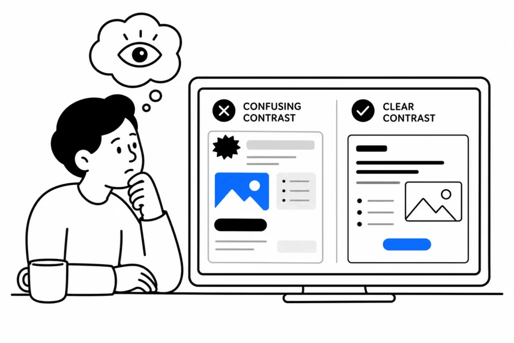
The problem is that a lot of contrast in e-learning is unintentional. Strong contrast in the wrong place pulls the learner’s eye away from what matters. Before you add contrast to a screen, ask yourself what you want the learner to see first. Then make sure your contrast points there.
Too many fonts make a course look undesigned. Pick two or three and use them consistently throughout.
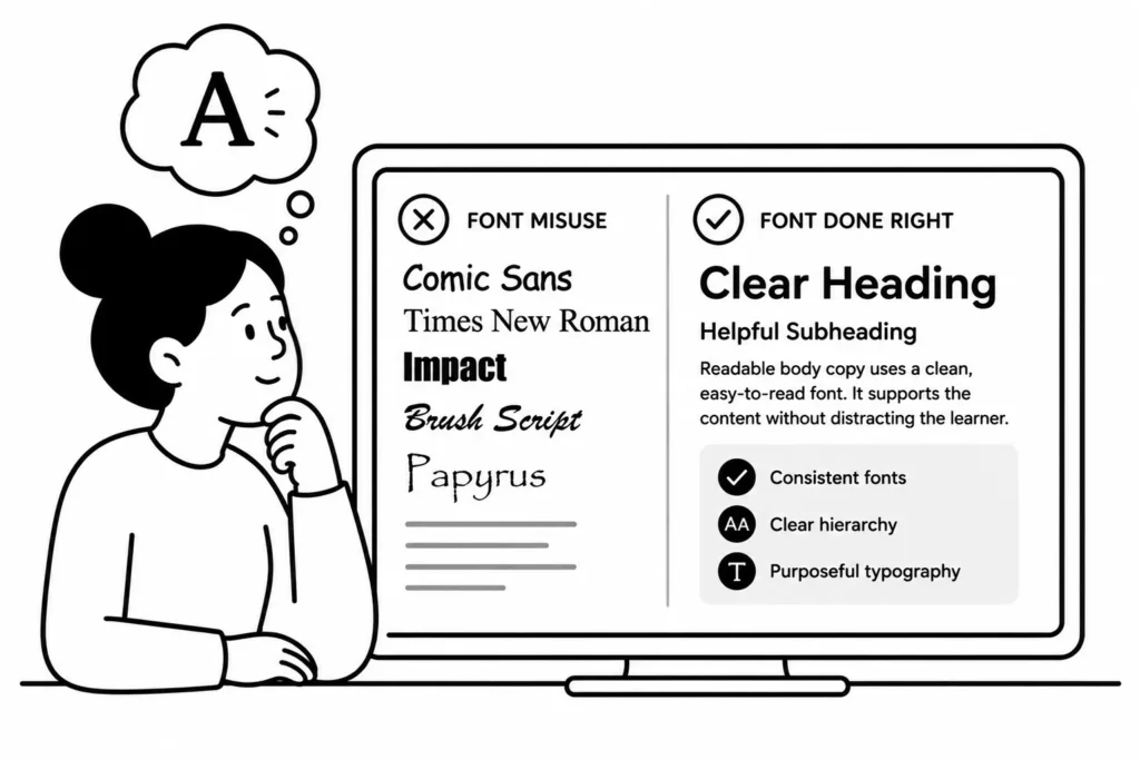
Fonts do two things at once: they display readable text and they communicate personality. A formal serif font in a safety course says one thing. Comic Sans says another entirely. Choose fonts that match the tone of your course. Use size and weight to create visual hierarchy. Treat fonts as a design element, not just a way to put words on screen.
Visual design decisions are course design decisions. The next time you build a slide, stop before adding an element and ask what it’s communicating. Audit one course you’ve already built with these five mistakes in mind. You’ll spot them quickly, and fixing them is usually faster than you’d expect. What visual design mistakes do you see most often in the courses you review?