Physical Address
304 North Cardinal St.
Dorchester Center, MA 02124
Physical Address
304 North Cardinal St.
Dorchester Center, MA 02124
Helpful ideas. Squeaky value.
Helpful ideas. Squeaky value.
Practical tips for shaping course content — structuring lessons, choosing formats, and turning raw material into something learners can use.
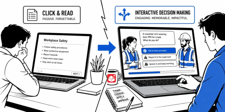
Most e-learning courses push information and call it training. The 3C model exists to fix that. It's a simple structure for building scenarios that put learners in real situations and let them practice making decisions.
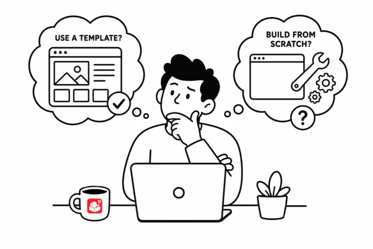
Every e-learning team eventually debates templates: are they a time-saver or a constraint? The answer is both, depending on where you use them. A smarter approach treats templates as tools for specific parts of the course, not a rigid structure for everything.
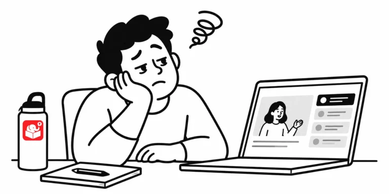
A course feels boring when learners can't see how it connects to their daily work. That disconnect is a design problem, not a content problem. The fix is building courses around what learners actually do, not just what they need to know.
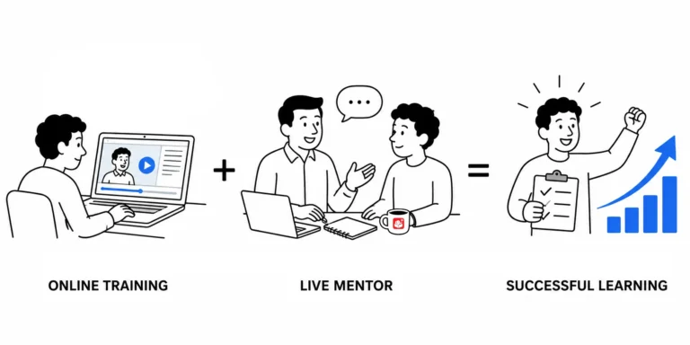
A new employee can absorb theory from a course, but real competence comes from doing the work. Pairing e-learning with peer coaching gives you a complete training system. A learning journal is the tool that connects both.
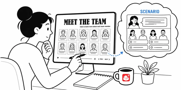
Most e-learning developers avoid gamification because it feels too complex to build quickly. But you can take a template you already have and add just a few interactive elements to change the experience entirely. Here's how a simple meet-the-team template became a decision-making challenge.

Screencast tutorials are some of the most common forms of online training. This makes sense since a large part of e-learning is predicated on learning new software. One challenge is creating effective and engaging screencasts. So today, we'll look at a few simple production tips to help you get started.
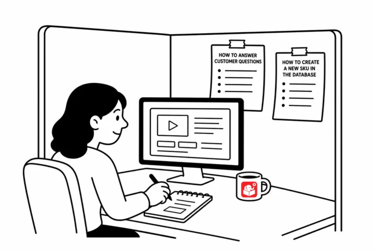
Employees kept building their own cheat sheets that did more good than months of formal training. Here's what that says about how much content actually belongs in a course, and a simple test to figure out what to keep.
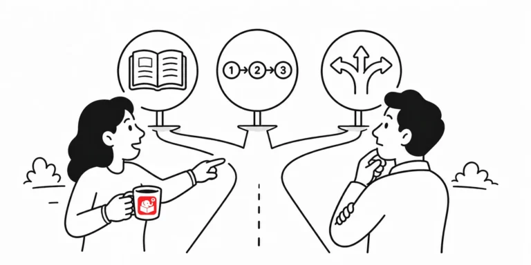
Not every course needs the same kind of design, and building the wrong type wastes time on both ends. Here's how to tell explainer, step-by-step, and principle-based courses apart, and why asking one question upfront makes the rest of the project easier.
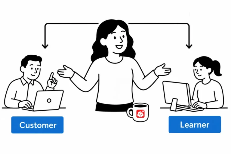
Most compliance courses feel pointless to the learner, even when the content matters. Here are three ways to frame that same content in a context people actually relate to, so it lands instead of getting tuned out.
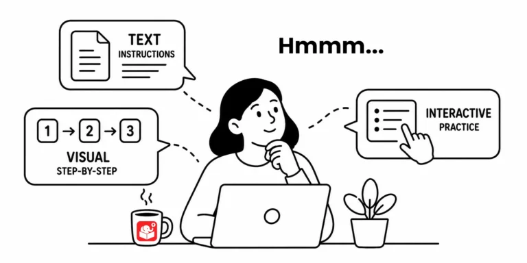
Some learners need explicit instructions. Others just want to jump in and figure it out. Here's how to decide whether to front-load instructions, deliver them at the point of need, or build them into a practice activity, and how that choice depends on your audience.
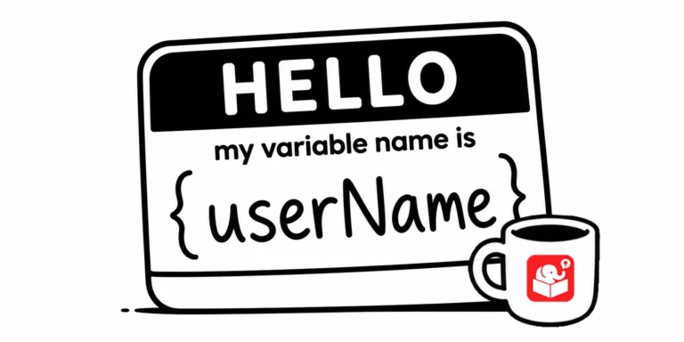
Come back to a Storyline project after six months and you'll see immediately whether your variable naming was thoughtful or rushed. Good names are easy to read at a glance. This post lays out a practical system for getting it right the first time.
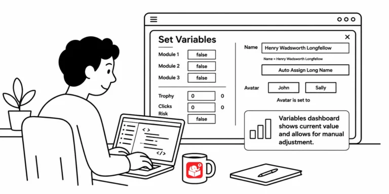
You've built a course with a dozen variables and need to test whether a specific trigger works on slide 20. That means clicking through every screen just to get there. A variables dashboard fixes that, and this post shows you how to build one.
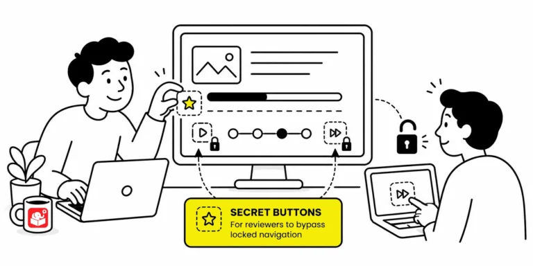
When a course locks every slide, reviewers must sit through narration and animations just to check one thing. That slows down feedback and makes troubleshooting painful. A hidden shortcut menu fixes it without affecting the published experience for learners.
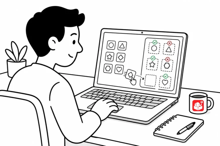
Tired of right-clicking and saving images one at a time? Here are two quick tools that pull every image off a webpage in one shot, so you can grab on-brand visuals for your e-learning courses without the tedious clicking.
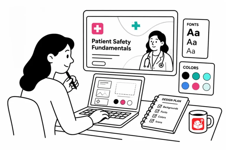
Wasting time hunting for the perfect elearning images? The problem isn't your search — it's letting random images drive your course design instead of planning the look first.



