Physical Address
304 North Cardinal St.
Dorchester Center, MA 02124
Physical Address
304 North Cardinal St.
Dorchester Center, MA 02124
Helpful ideas. Squeaky value.
Helpful ideas. Squeaky value.
Everything about creating online training and courses, from the thinking behind good instruction to the tools and tricks used to build it.
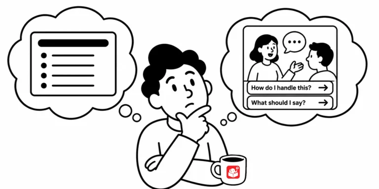
When e-learning developers say they want more engaging courses, they usually mean more branching. But navigation type has almost nothing to do with engagement. What actually matters is whether the content connects to the learner's real world.
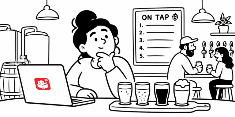
Most e-learning gets judged by how interactive it is or what tool built it. That's like judging a beer by its ABV. Different courses solve different problems, and the right one for the job is the best one.
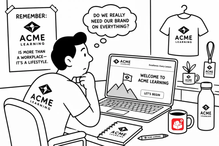
Every e-learning team gets the request: add our logo and brand colors to every screen. But does it help learners learn? Here's a quick case for questioning how much branding actually belongs in a course.

I've noticed that most e-learning project headaches come from the same place: unclear communication. The fix is simpler than you'd expect. It starts with how you write emails.
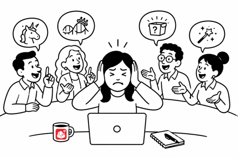
There are certain phrases that make any experienced instructional designer pause. They usually signal scope creep, unrealistic timelines, or a misunderstanding of what learning design actually involves. Recognizing them early is half the battle.

People keep hunting for the right software feature to build their interaction, but the fix isn't a better tool. Here's the 3C model for building interactivity with whatever features you already have, plus a few ways to bend common interactions like flash cards and tabs to do more than they were built for.
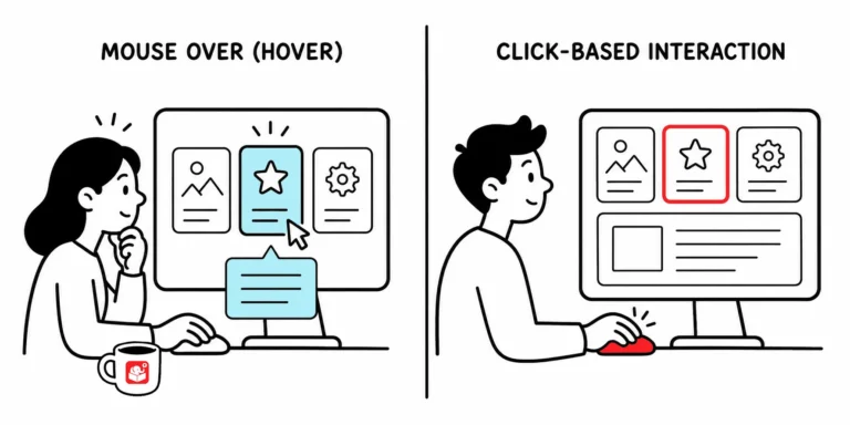
Mouseover interactions feel familiar, but mobile screens and accessibility standards are making them harder to justify. Here's why click-based design makes more sense for most new courses, and how to spot which of your hover interactions could easily become clicks.
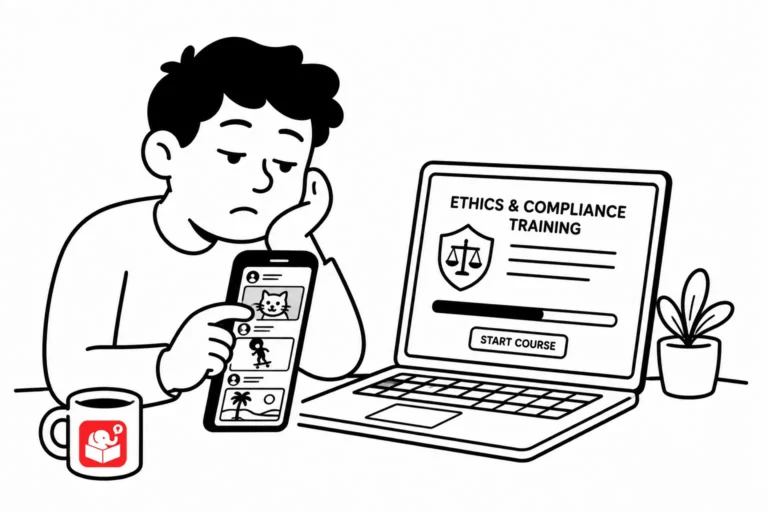
People don't read online the way they used to, they scan, skip around, and look for the parts that matter. Here's how to design courses that work with that instinct instead of fighting it, from surfacing key points to building in real-world connections.
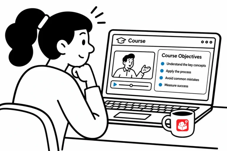
Most e-learning courses lead with a bulleted objectives screen that few learners read carefully. There's a better way to meet the requirement without losing the learner before the course even starts. This post covers two simple alternatives that reduce clutter and keep things moving.
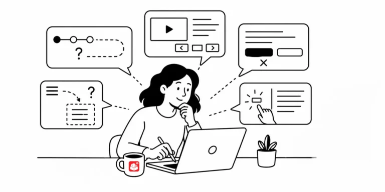
When a learner has to stop and think about how to interact with your course, you've already lost some of their attention. Small navigation and design inconsistencies compound quickly. These four habits help you spot and prevent the most common usability problems.
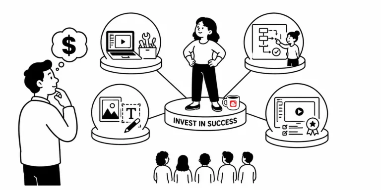
Organizations often expect performance gains from a small training investment, then blame the tool or the team when results don't show up. Here's why that gap exists, the range of skills good e-learning actually requires, and why knowing whether you're building a compliance course or a performance course changes everything.
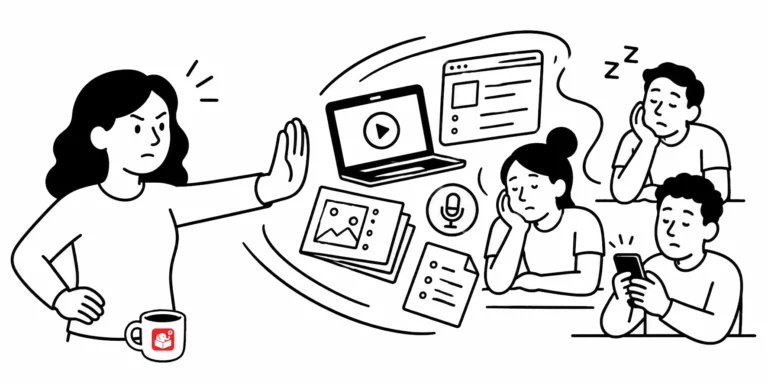
Nobody buys baby shower gifts because they got an email about a moose. And nobody learns from a course that has nothing to do with their real work. Here are three ways to close that gap and build training that actually sticks.
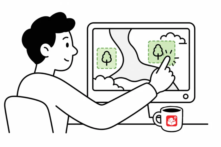
Interactive hotspots do more than trigger clicks. Use them as invisible buttons to speed up production, or as barriers that block interaction with what's underneath. Here are three ways to put them to work in your next course.
Years ago, a lot of people needed basic elearning help and there wasn't much out there for them. The tools have changed, AI is everywhere, but the need to build good courses hasn't gone anywhere. Here's what's new, what's carried over, and what you can grab for free.



