Physical Address
304 North Cardinal St.
Dorchester Center, MA 02124
Physical Address
304 North Cardinal St.
Dorchester Center, MA 02124
Helpful ideas. Squeaky value.
Helpful ideas. Squeaky value.
Infographics look great because they distill mountains of information down to a few essential points, the same challenge you face every time a subject matter expert hands you a 300-slide deck. Here's what they teach you about focus, color, fonts, and icons in your own courses.
Splitting training into e-learning modules and peer coaching sounds simple, until you get into the details. Here's how I designed the blended training program's note-taking journal, review questions, and peer coach process that bridge the two, plus a self-assessment checklist you can turn into a real training record.
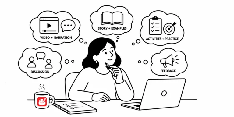
You put information on a screen. Your learner reads it. But what they walk away understanding isn't always what you meant. Here's how to design courses that close that gap.
Open a random e-learning course and you'll often find graphics that seem to have landed on screen by accident. Every visual element communicates something to learners, whether you meant it to or not. These foundational design principles help you take control of that message.

A lot of people think e-learning is just about speed. But speed only helps if you've set yourself up properly. The right tools, accessible assets, and a predefined course structure are what actually make rapid development work.
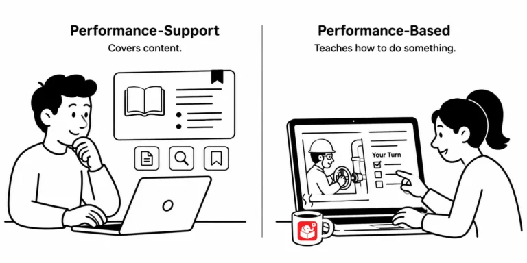
Not all e-learning is the same, even though we lump it all under one label. Some courses share information. Others are meant to change what people can actually do, and knowing the difference changes how you should build the next one.

A course ends the moment learners click finish, but the job doesn't wait. A learning journal bridges that gap, turning one-time training into something learners can lean on long after the course is over.

The instinct to lock every screen in a course is understandable. If learners can skip freely, how do you know they learned anything? The answer is in the assessment, not the navigation.

Learn how to build a zoomable, interactive course using a single image and Storyline 360's zoom region feature. This tutorial walks you through the full process with a working example and free resources.
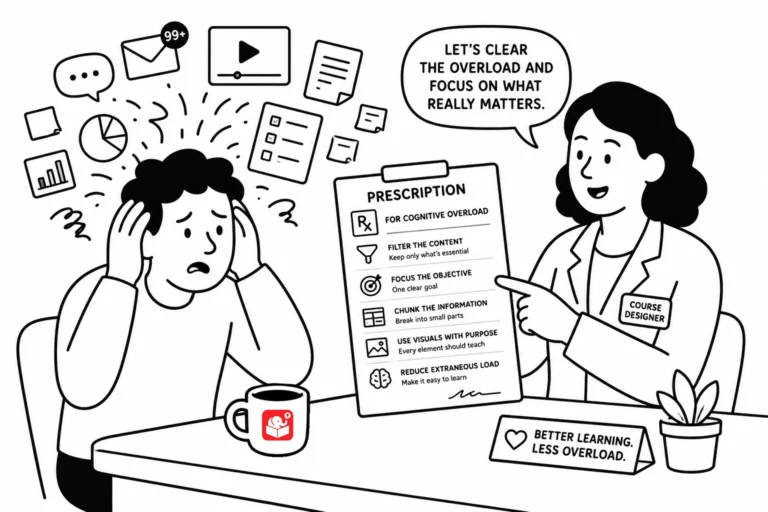
Good course design isn't about adding more. It's about removing the stuff that gets in the way of learning. Here are a few practical things to keep in mind when cognitive load is working against your learners.
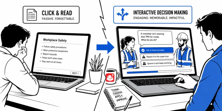
Most e-learning courses push information and call it training. The 3C model exists to fix that. It's a simple structure for building scenarios that put learners in real situations and let them practice making decisions.
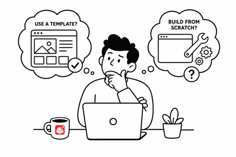
Every e-learning team eventually debates templates: are they a time-saver or a constraint? The answer is both, depending on where you use them. A smarter approach treats templates as tools for specific parts of the course, not a rigid structure for everything.
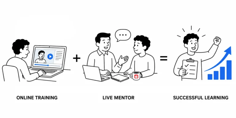
A new employee can absorb theory from a course, but real competence comes from doing the work. Pairing e-learning with peer coaching gives you a complete training system. A learning journal is the tool that connects both.
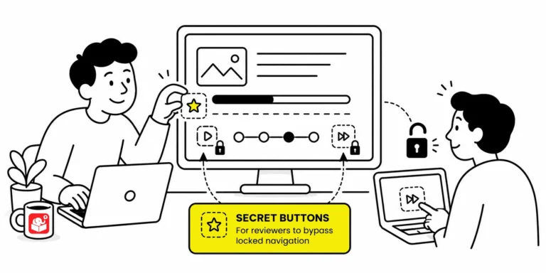
When a course locks every slide, reviewers must sit through narration and animations just to check one thing. That slows down feedback and makes troubleshooting painful. A hidden shortcut menu fixes it without affecting the published experience for learners.
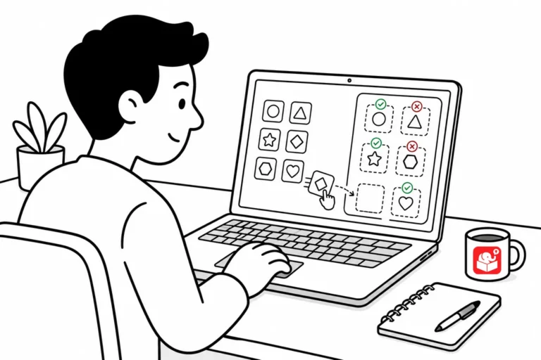
Tired of right-clicking and saving images one at a time? Here are two quick tools that pull every image off a webpage in one shot, so you can grab on-brand visuals for your e-learning courses without the tedious clicking.



