Physical Address
304 North Cardinal St.
Dorchester Center, MA 02124
Physical Address
304 North Cardinal St.
Dorchester Center, MA 02124
Helpful ideas. Squeaky value.
Helpful ideas. Squeaky value.

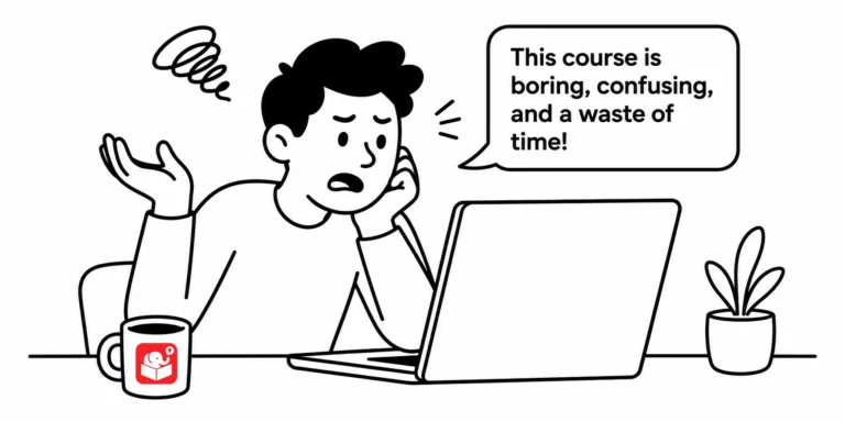
I asked a group of people to describe their training experiences. The same words kept appearing: boring, irrelevant, and a waste of time. That response is uncomfortable, but it's also a roadmap.
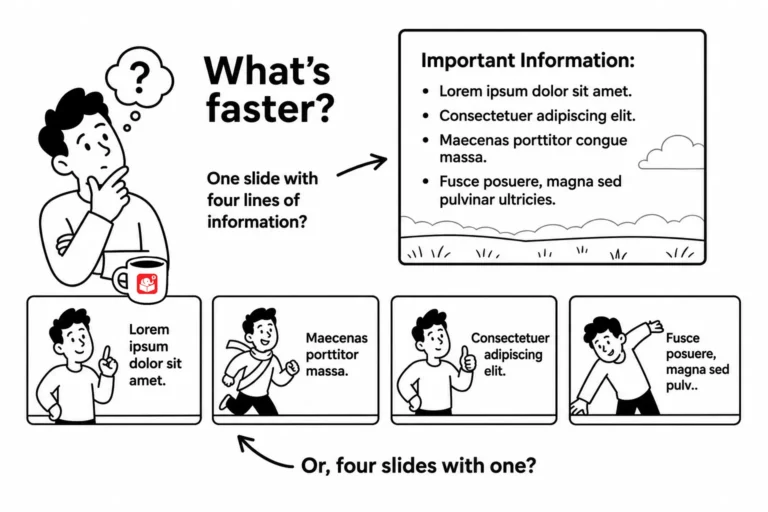
Your client wants 20 slides. Your SME insists on 50. But the learner never looks at the slide counter. The real question isn't how many screens a course has. It's whether those screens help learners do something they couldn't before.
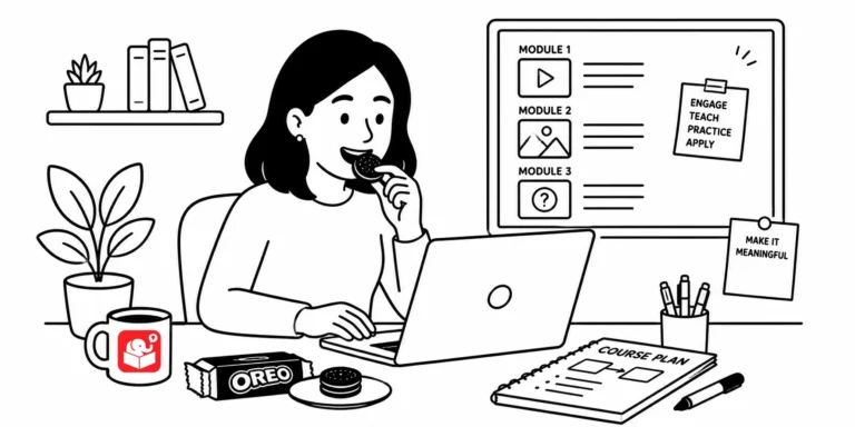
The easiest way to waste a training budget is to build a course nobody asked for. Most of us design around the content we have, not the problems learners face. The OREO framework gives you a practical way to flip that.
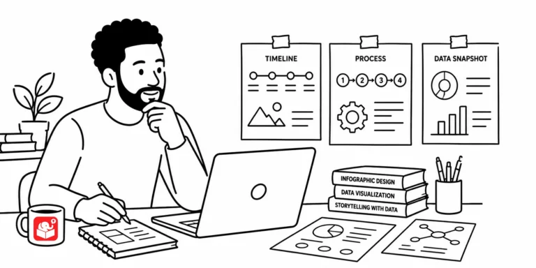
Infographics look great because they distill mountains of information down to a few essential points, the same challenge you face every time a subject matter expert hands you a 300-slide deck. Here's what they teach you about focus, color, fonts, and icons in your own courses.
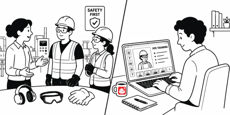
Splitting training into e-learning modules and peer coaching sounds simple, until you get into the details. Here's how I designed the blended training program's note-taking journal, review questions, and peer coach process that bridge the two, plus a self-assessment checklist you can turn into a real training record.
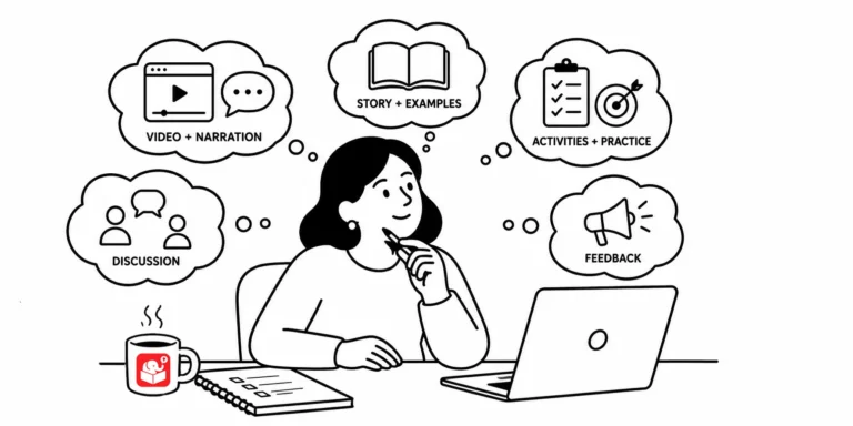
You put information on a screen. Your learner reads it. But what they walk away understanding isn't always what you meant. Here's how to design courses that close that gap.
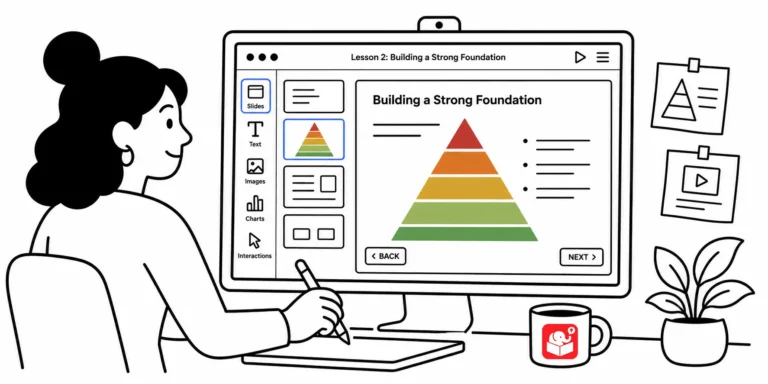
Open a random e-learning course and you'll often find graphics that seem to have landed on screen by accident. Every visual element communicates something to learners, whether you meant it to or not. These foundational design principles help you take control of that message.
I read an article about how Google's designers rethought their products, and it hit close to home. A lot of what tripped them up, sticking with consistent navigation, resisting the urge to fill white space, getting buy-in for change, are the same things we deal with building e-learning. Here's what I took from it.

Slides are a natural starting point for Zoom presentations, but they have real limits. Rise gives you built-in interactivity, a sidebar for navigation, and a shareable link that doubles as a leave-behind resource. One Articulate trainer made the switch and hasn't looked back.

The most common question from aspiring e-learning developers isn't about software features. It's about where to begin. Here are the practical habits, portfolio strategies, and community moves that make the difference.



