Physical Address
304 North Cardinal St.
Dorchester Center, MA 02124
Physical Address
304 North Cardinal St.
Dorchester Center, MA 02124
Helpful ideas. Squeaky value.
Helpful ideas. Squeaky value.
Tips on the graphic side of course-building — color, images, icons, characters, and layout.
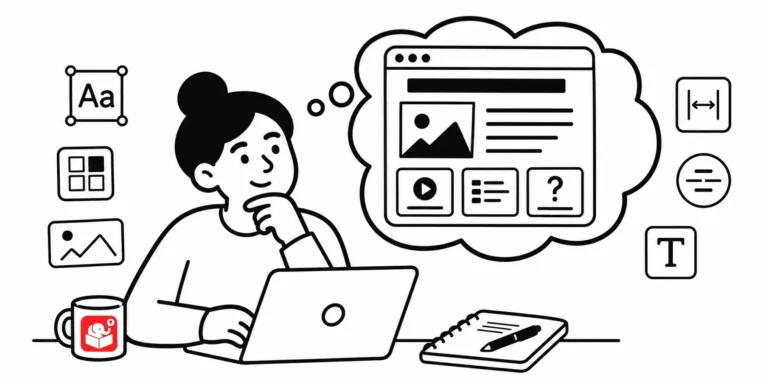
Most e-learning developers aren't trained graphic designers, and that's completely fine. But a few recurring visual mistakes make an otherwise solid course look unprofessional. Here are five of the most common ones and what to do about each.
Cluttered slides with competing colors are one of the most common visual design problems in e-learning. Two techniques can fix most of it: strip everything to greyscale and add one accent color, or go the other direction with bold silhouettes. Both are quick to apply and the results show immediately.

People judge things by how they look. That's not shallow, it's just how attention works. If your e-learning course looks thrown together, learners assume the content is too. Here's how to change that without a design degree.

Most e-learning developers aren't graphic designers. But a few core principles can take your courses from visually cluttered to genuinely clear. Here are three that make the biggest difference.

Most e-learning developers came up through training, not design — and it shows. This post covers the visual design principles every course builder needs, why AI tools can't replace that foundation, and one book that puts it all together.
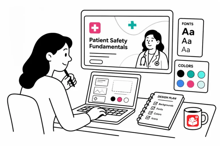
Wasting time hunting for the perfect elearning images? The problem isn't your search — it's letting random images drive your course design instead of planning the look first.

Most e-learning courses have natural pause points where learners need context before they move forward. Gate screens fill that role, and they show up in more courses than you might expect. Planning for them early makes the whole production process faster.

If you've ever updated a theme color and found that half your template didn't change, you've run into the custom color problem. This quick trick makes it easy to spot every object that isn't using a theme color before it becomes a real headache.

Copying another developer's work and calling it your own can quietly damage your career. The good news is there's a better path. Here's a three-step process for turning inspiration into skills that belong to you.

Not all images help learners. Some get in the way. Research shows that decorative images can actually make learning harder. Here's how to choose images that pull their weight.

After sharing a Rise interactive scenario demo, I got a lot of questions about how the graphics were built. The headers, flashcard images, and character graphics all came from PowerPoint. This post walks through the exact workflow, including how to set slide sizes and export images for Rise blocks.

Older PowerPoint scenarios can be hard to manage and even harder to update. Rise offers a cleaner alternative that's fully responsive and easier to maintain. This post walks through one conversion, from planning the interaction design to working around Rise's constraints.

The fastest way to level up your e-learning design is to pick a course you admire, take it apart, and try to build it. This post covers why that works and what you learn in the process.

A cluttered screen doesn't just look bad. It makes learning harder. Here's what a famous comparison between two presentation styles can teach you about designing e-learning courses.

Originally published: January 16, 2018 Original URL: Emojis are basically modern-day hieroglyphics. Picture archaeologists thousands of years from now spending years digging up old emoji messages, then more years trying to figure out what they mean — only to…



